Why I Decided To Do This
Whenever I use an app, I give it a rating. I think we all do that, whether it’s a conscious or unconscious effort. And I think the reason we do that is because apps are products / services that make us feel some kind of way, mostly because we have certain expectations about them.
My rating system asks these questions:
- How well is it designed ?
- How easy is it making things for me?
- What experience do I have while using it?
- How well does it do what it’s supposed to do?
Because I do most of my online shopping on Amazon’s platforms, I naturally have opinions about it. I felt there were a few improvement opportunities, mostly to the UI, to enhance the overall shopping experience.
Amazon does what it’s supposed to do: it helps me get the products I need / want quickly and with minimal effort. But it would be great if the app not only did what it’s supposed to do, but also looked and felt good while doing it.
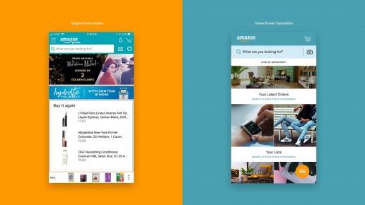
I took some time to review the current screens and took into account the ways I’ve felt while shopping to come up with a quick exploration of what could be. The following exploration was a fun project—in no means affiliated with Amazon.
How I Approached the Exploration
One of the first things I did in this exploration was to gather all of the assets I’d need. I searched online for the Amazon Brand Guidelines, downloaded the logomarks, and put together a color palette using Amazon brand colors. I also did a bit of research for inspiration and for insight as to some of the industry’s latest work.
My Process
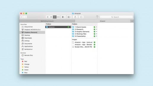
The image below shows my folder structure but also gives a bit of insight to how I approached the exploration. I tend to organize my folders so it’s easier to find elements as I’m designing.
Brand Guidelines & Color
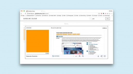
Whenever I need to find brand guidelines & colors, I try to find these directly from the brand. If I’m not successful, I’ll refer to these websites: BrandColors and Guideline Colour.
BrandColors gives you the brand color’s hex code that you can copy/paste or download. I used these for my exploration: https://brandcolors.net/b/amazon
Guideline Colour has the same function but also gives you the brand guidelines if available: http://guidelinecolour.com/amazon
I used these resources to gather my assets whenever I could find them. If there were design elements that I couldn’t get like the Amazon font family or the Amazon Prime logo, I used another font and recreated the logo. My goal was to approach the exploration as close to an actual client project as possible.
Design Elements
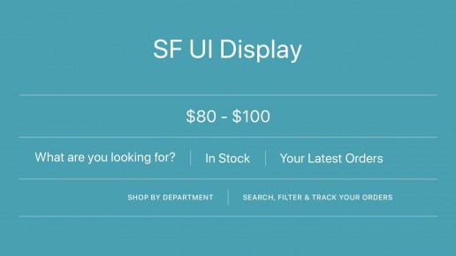
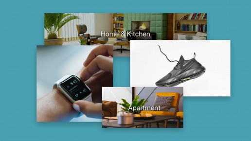
After gathering all the assets I could find, I assessed which were pending. I added a few more colors to the palette—variations of the Amazon Yellow & Blue. Since I wasn’t able to find the Amazon font family, I used SF UI Display (the system font for Apple.) I also recreated the Amazon Prime logo and the photography was from Unsplash.


App Analysis
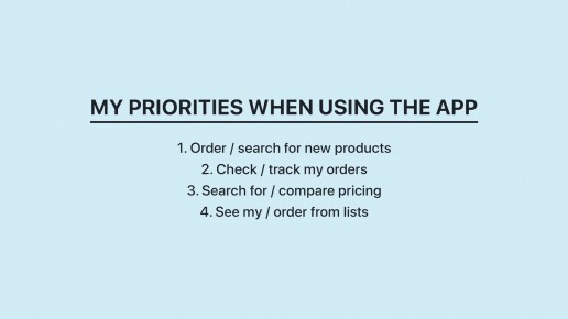
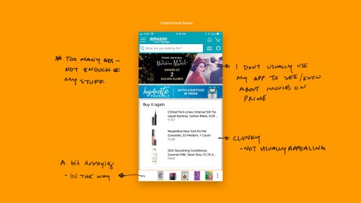
Once I had all of the design elements I needed and colors and fonts I’d use, I began making notes of the things I’d improve in the Amazon app. I took into consideration the functions / features I use most. I then used these to build a visual hierarchy.
Wireframing
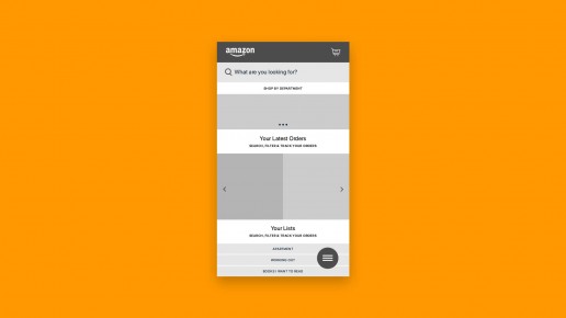
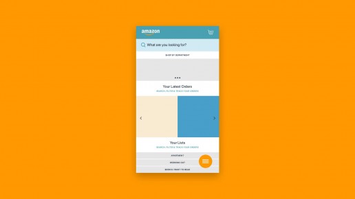
After I established my app priorities, I began building a wireframe to figure out placements and overall flow. Once I did that, I added some color to make sure the elements worked well together, while also confirming that they worked well individually— since each element had to function independently.
Explorations & Comparisons
The wireframes helped me get a sense of the design direction. Once I had a layout I was confident in, I began putting together the following screens: Home Screen, Navigation/Menu, and Product Screen.
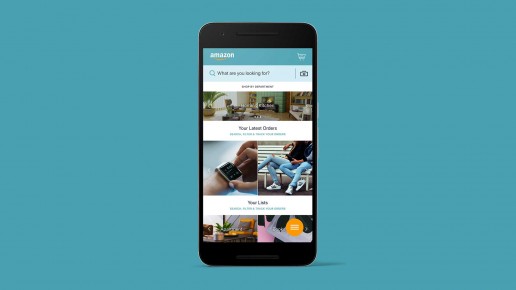
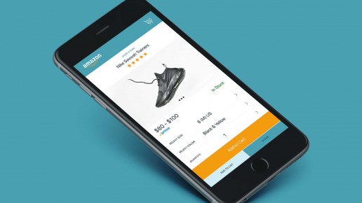
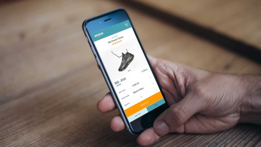
Below I’ve put the original screens (before) and the explorations (after) side-by-side for better comparison. I’ve also displayed the screens in mobile as that helps us see the exploration in context.
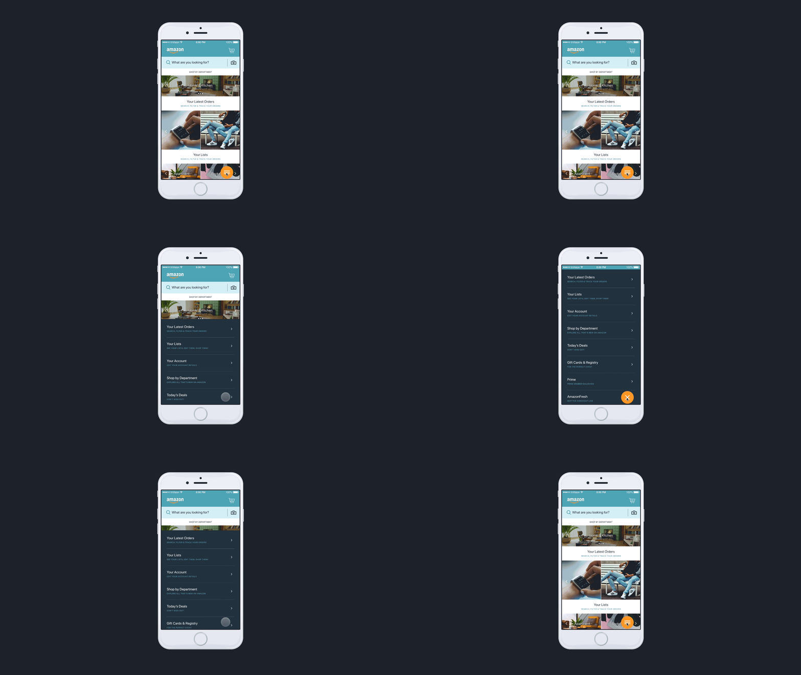
The Home Screen
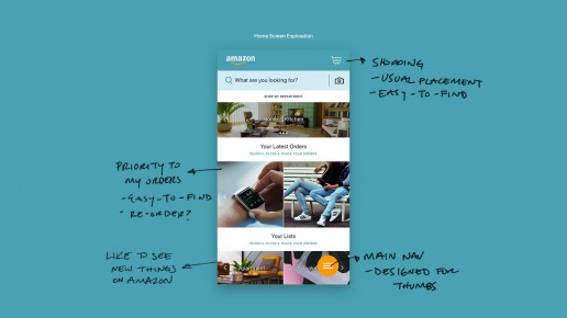
The priorities of this screen for me are:
- The ability to search products
- Having an overview of the things I may want to purchase (in departments & lists)
- Having an overview of the the things I’ve already purchased


The Navigation Screen
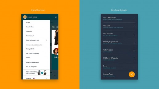
I’ve designed this menu with the “Design for Thumbs” approach. As phones change in size (get bigger), the area that your thumbs can reach is minimized. Placing the navigation within thumbs reach enhances the user experience.
For more on designing for thumbs, read: Mobile First: Insights from going Mobile Only
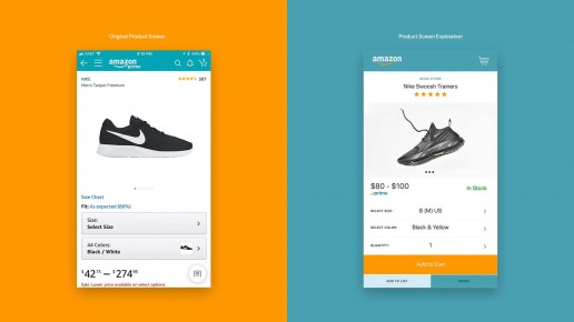
The Product Screen
My biggest complaint about this screen is the location of the “Add to List” and “Share” features on the screen—making it difficult to find. Keeping that in mind, I made these features a bit more prominent in the exploration.
The visual hierarchy was lead by the things I look for the most when making purchase decisions about the product.
Conclusion
I’ve simplified Amazon into these few screens in order to quickly explore what I’d love my experience to be. Amazon is a complex system with new features being added often so hats off to the teams that put this incredible product together.
What did you guys think of the exploration?
