

Long Story Short: The current Florida Drivers License design and layout could use some improvements. The design should not only highlight important areas, work better for text legibility, but also have a bit of The Sunshine State flair.
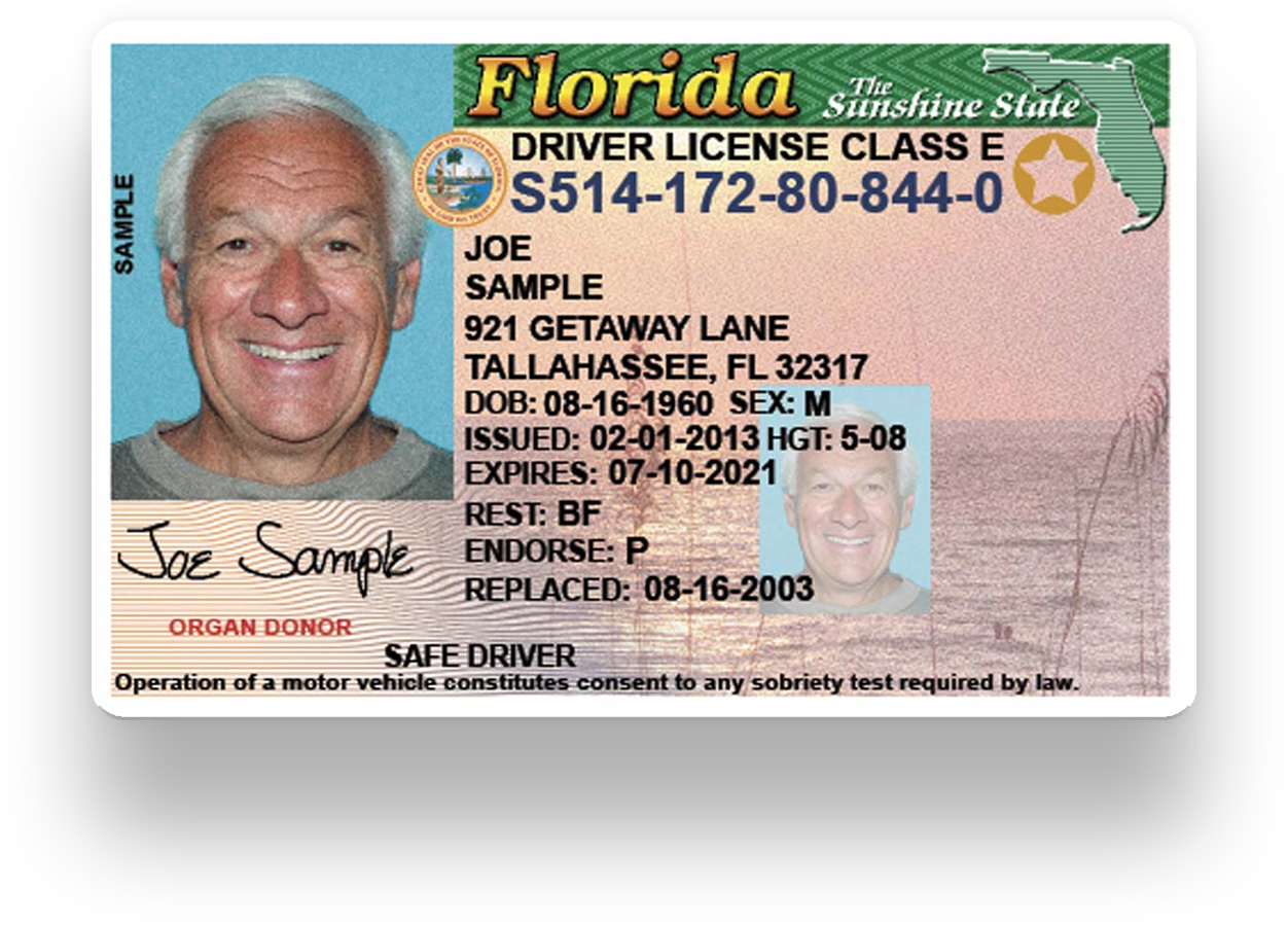
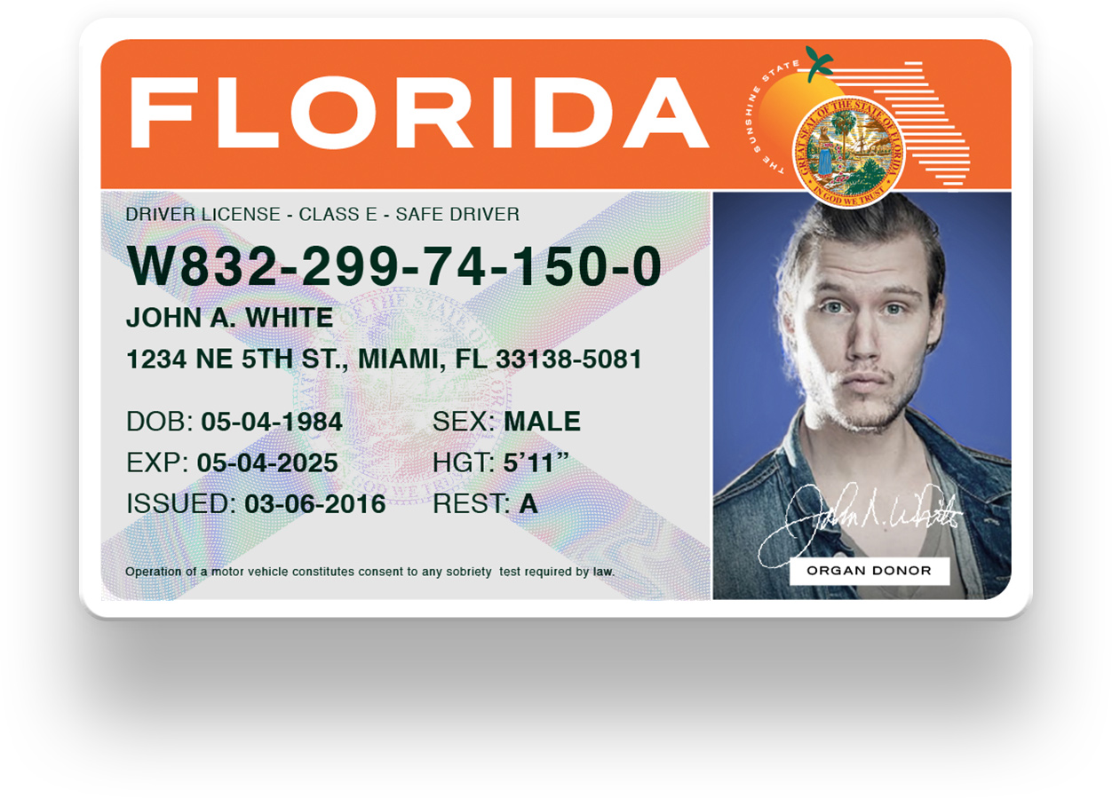
CURRENT FLORIDA DRIVERS LICENSE
Full Story: A few days ago, the Florida Department of Highway Safety and Motor Vehicles announced an updated design to the Florida Drivers License. It’s timely since I had been working on a refresh of the Florida License for a few months and it was a bit of a process.
My family moved to Florida from Puerto Rico in 1991, so I consider myself a bonafide Floridian. I’ve had my ID, Restricted and Florida Driver’s License (which I failed the first time) in various incarnations.
Recently, my wife needed to renew her driver’s license. The whole web experience of renewing is another conversation. So I pulled out my license to see when mine would expire. Whilst baffled at my license photo and how on earth I was let out like that (I was in art school,) I noticed how dated, busy and all over the place the layout of the license is. Didn’t even realize there was some kind of watermarked photo in the background of some beach sunset? idk. Many government agencies are known for having stale aesthetics, so the bar was not very high.
I wondered if there was a way to make new Florida Drivers License layouts that worked a little better and gave more importance to certain parts of the License. The first though is, “what’s the first thing you should see in an identification card /driver’s license?”
Here are a few things I think are the most important when someone like a Police Officer, Banker, Bartender etc will look for in an I.D., sometimes, in different order.
- Photo of Person
- ID/Lic. Number
- Name
- Birthdate
- Expiration
Not that the other information isn’t important, but these, in my experience, take priority. So the card should be laid out in a way that these sections are easier to spot at a quick glance.
⚠️ Note: To keep things simple, I focused solely on layout of one side of the license. I omitted some security features, extra symbols, some information and different types of identification cards that will roll out in the new Florida License coming out late 2017.
License Layout
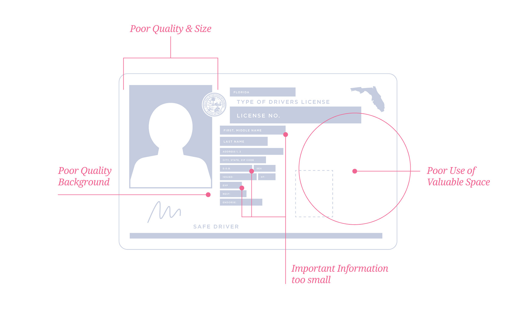
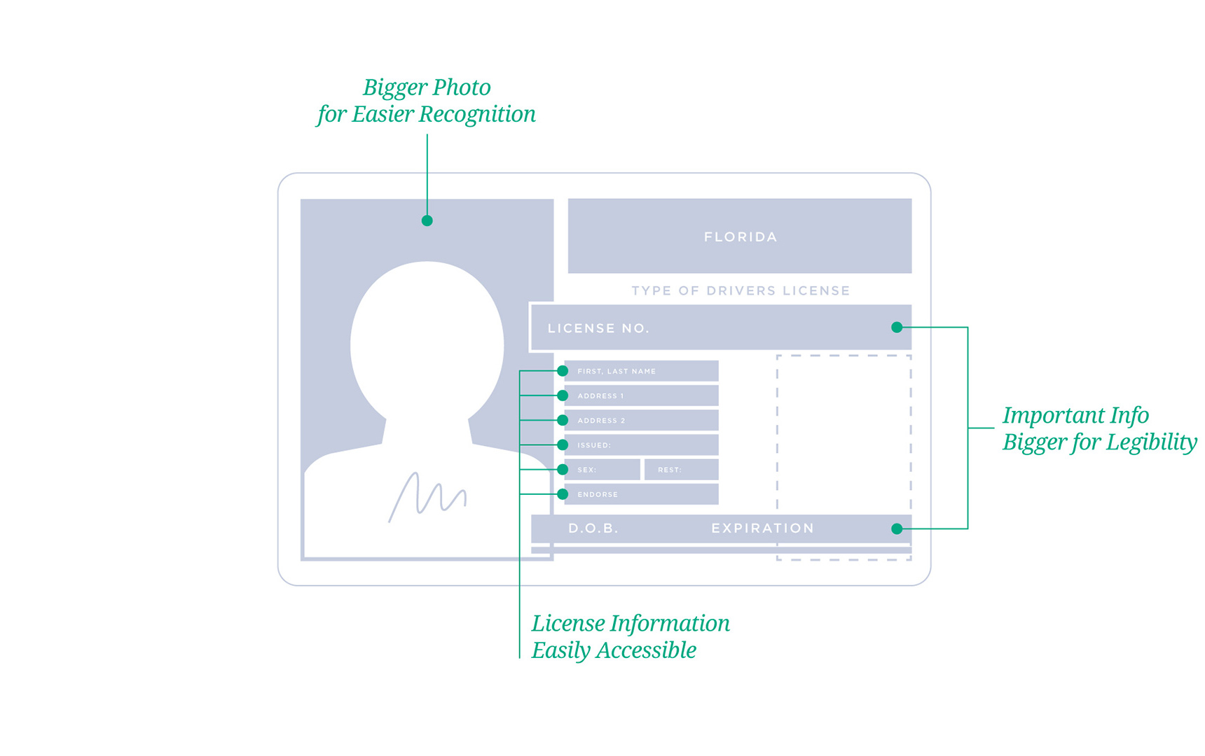
The first thing I needed to do was see how the current license is put together and look for opportunities to improve it. I made a quick grid and wire-framed the layout to see where everything stands as of mid 2017.
You’ll notice a few areas where we can improve for better “functionality.” Bigger photo, easier to read name, birthdates etc.
CURRENT
UPDATED
Exploration
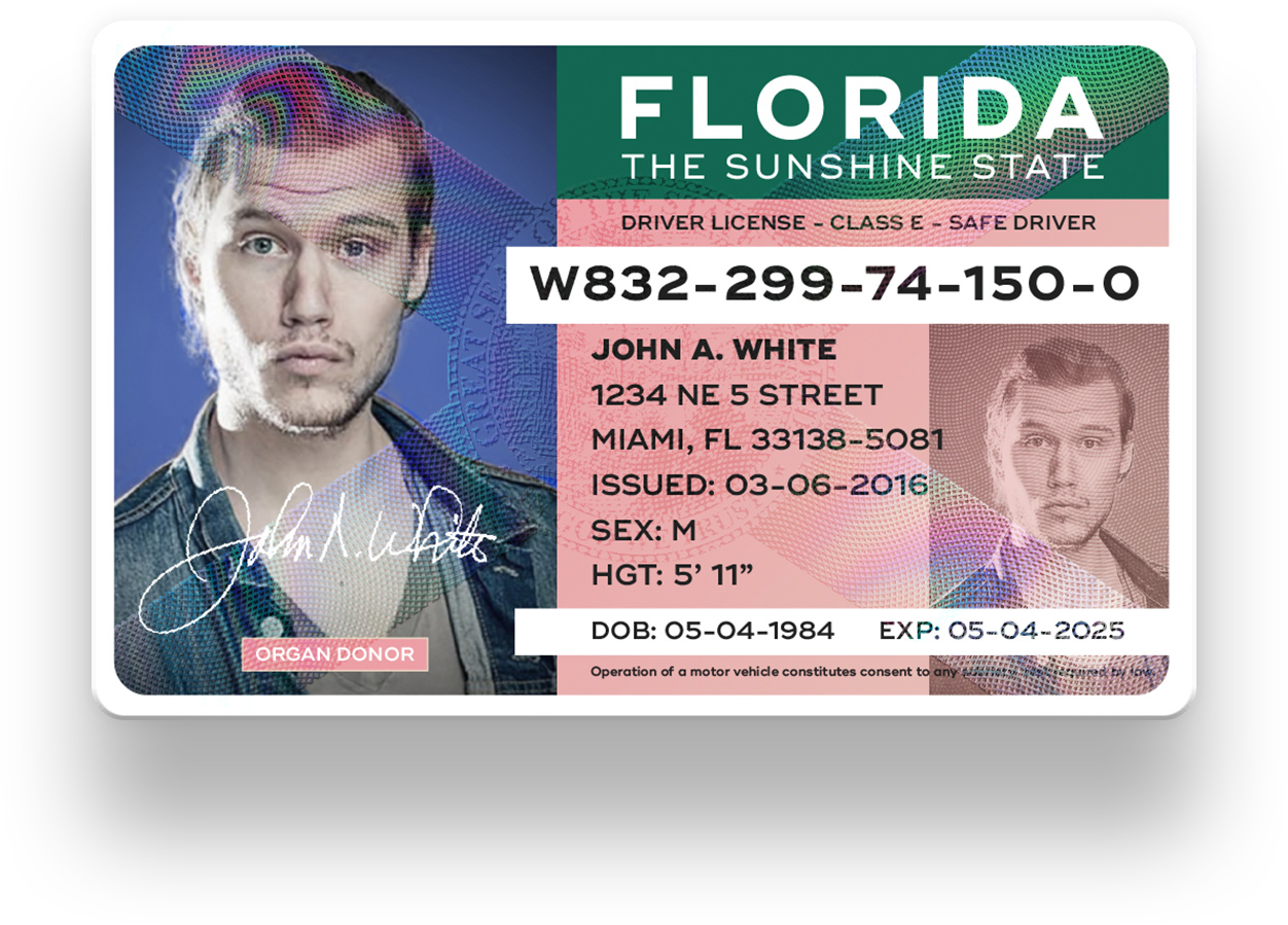
So once I decided which parts should be the center of focus, I started pumping out some layouts. Used one of the funny headshots from Made By Sidecar’s bundle; various typefaces like Gotham, Heroic, Interstate (which is appropriate,) Reservation Wide; and colors, lots of colors to give it a bit of that Sunshine State personality.

Concepts
After exploring various approaches, I settled on 8 different layouts. Some share similarities, while others their own design styles. The trickiest part was the copy/text size. The point size had to be big enough for anyone to read and small enough to allow room for it to breathe. Here are the 8 concepts.
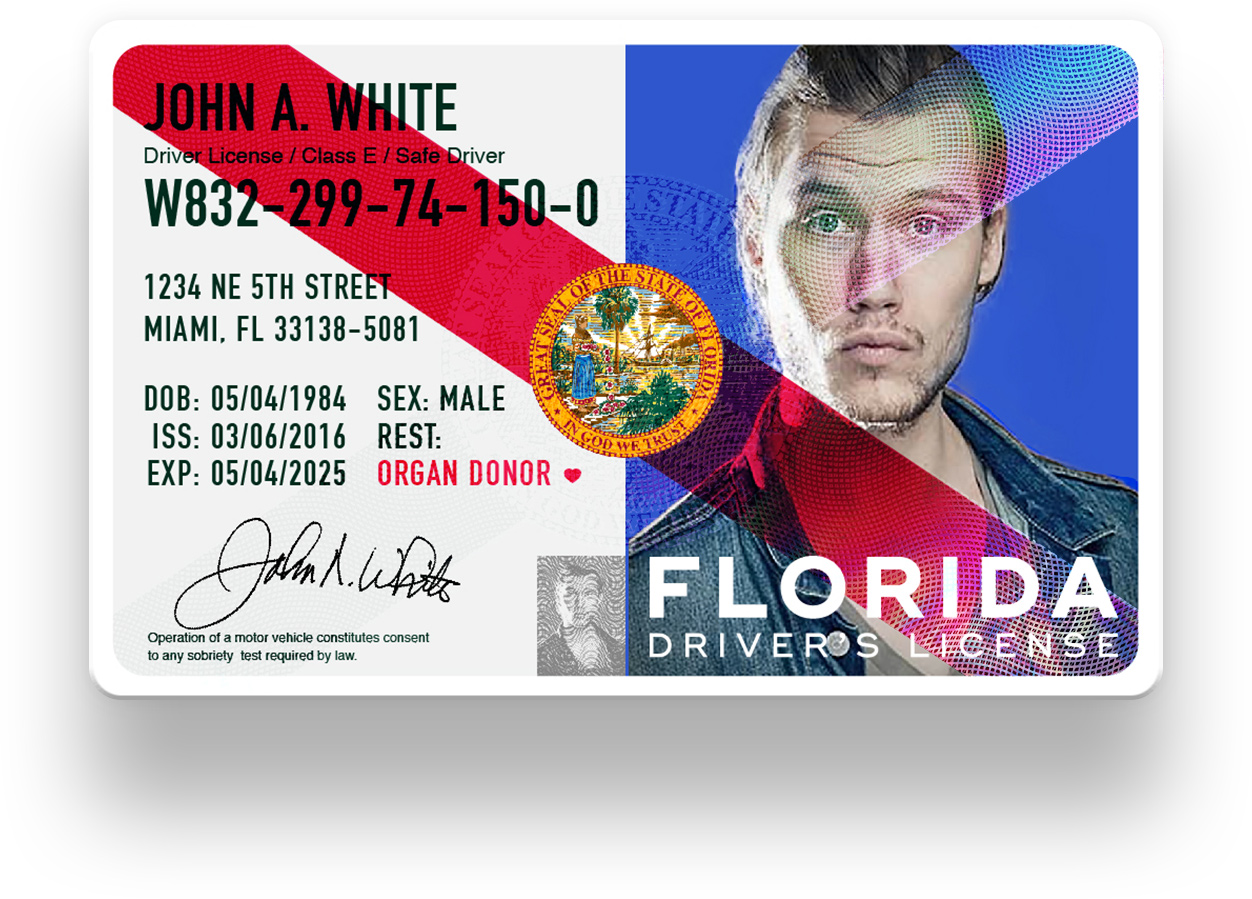
STYLE A
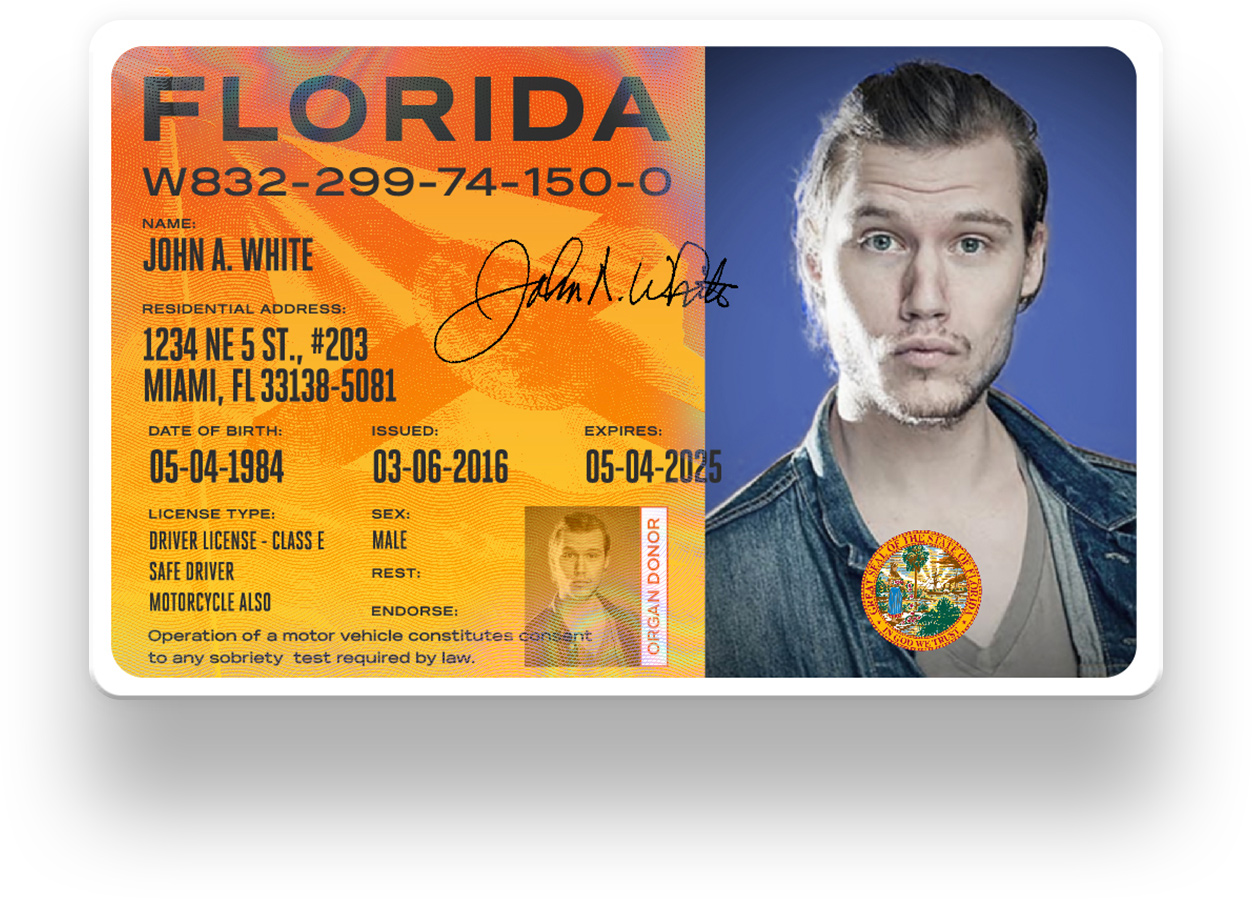
Classic. More of an evolution of the current design based on the first wireframe, Style A has no extra features other than a security flag over the license. Colors are the same as the current version.
STYLE B
Minimal. Style B is extra fresh. Added the seal, the Florida map and a neat “Sunshine State” orange for highlights. A security holographic Florida flag over the important information.
STYLE C
Red Stripe. Style C has the bold stripe of half the Florida flag. The photo is also XL — easier to see peoples faces since it takes almost half the card. Security hologram Florida flag filling in the rest of the stripe and over the whole card.
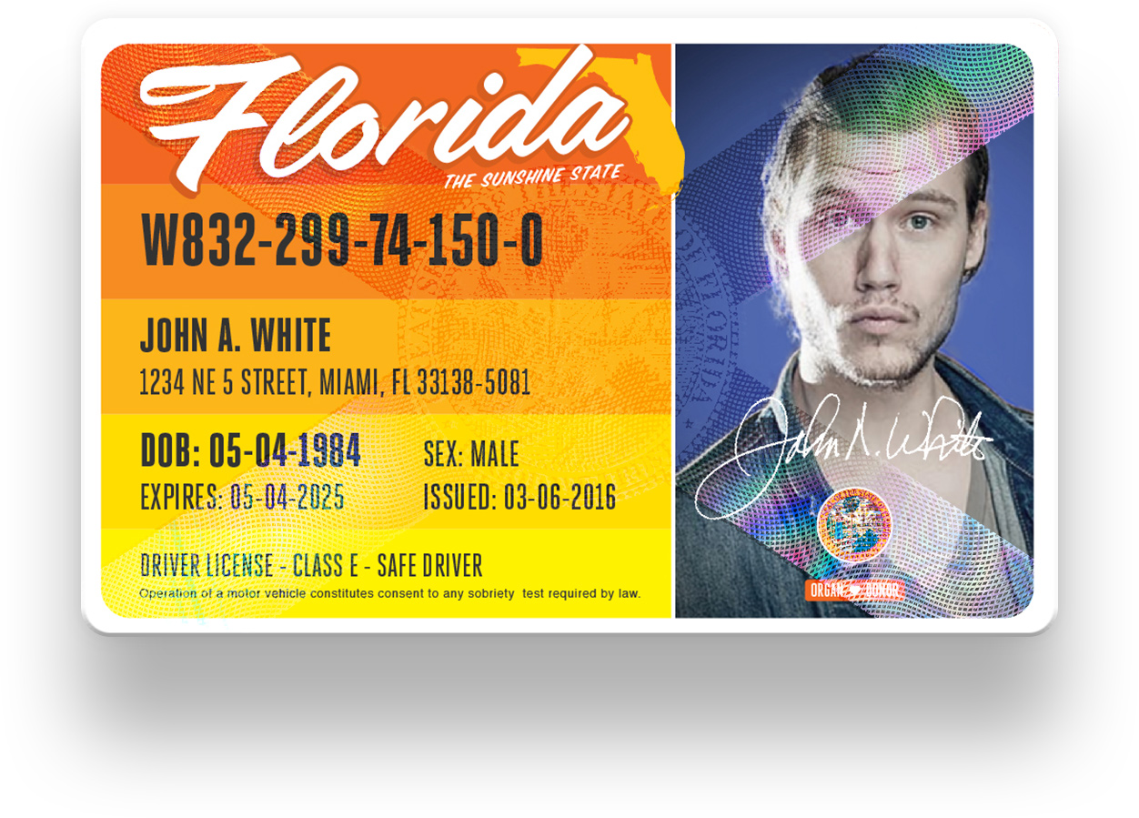
STYLE D
Postcard. When I think of our state, I think of the warm sun-rays, the beach and delicious orange juice. Some delicious orange color bands so it feels warm and friendly.
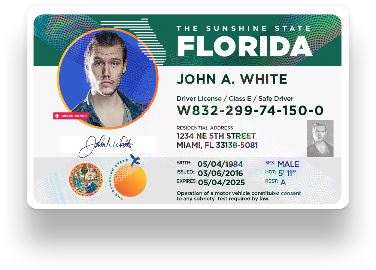
STYLE E
Euro. Inspired by the clean licenses and identification cards overseas, Style E has plenty of white space to allow the information room to breathe. The green bar at the top is reminiscent of the Florida Turnpike signage you see on the road.
STYLE F
Sunrise. Large photo and a flood of color. Style F is very organized for legibility. The yellow to orange gradient reminiscent of the Florida orange and the rising sun. The flag over the information as security hologram.
STYLE G
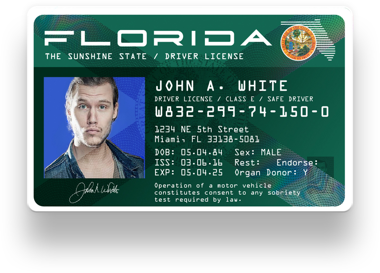
Interstate. Inspired by those “Welcome to Florida” signs you see in the highway, a similar layout to Style A but with some modifications.
STYLE H
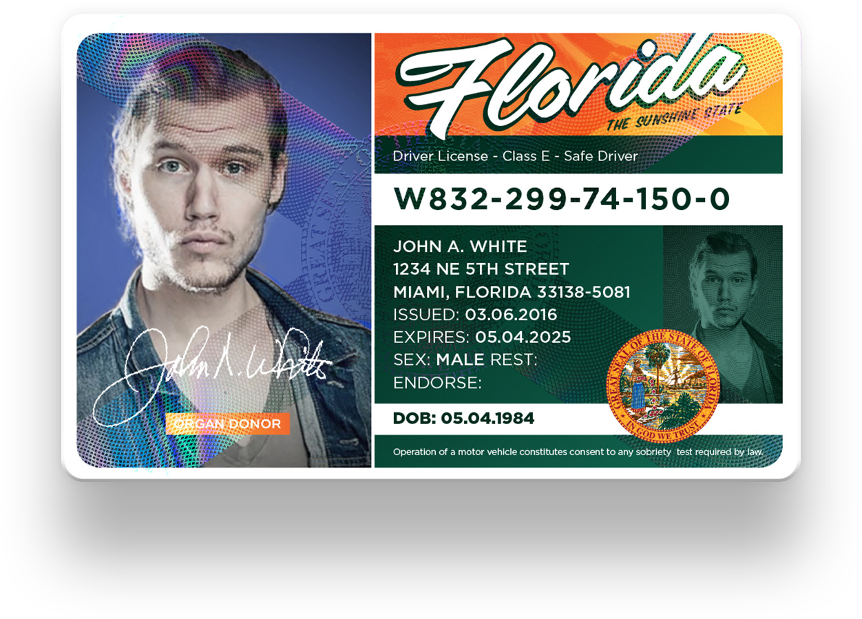
Florida 2049. We live in the future! What would a Florida Driver’s License look like 50 years or so from now. Inspired by RoboCop, Blade Runner, Ghost in the Shell and all those awesome futurism films. Threw in some OCR typography. The “FLORIDA” type was custom built based on an experimental typeface I’m working on called Neu-Corp. Security hologram with the Florida Flag and the interstate green color.
Visual Comparison
I started concepting these months ago but after the announcement of the redesign by the FLHSMV, it was time to let these live out in the wild.
This particular project was fun as hell to play with. Of course, there are many more things Government agencies would need to consider for identification and a bunch of information to fit in a small card, but it all starts with a solid layout to build on and go from there.
—
Angel A. Acevedo
[fa type=”instagram”] [fa type=”twitter”] [fa type=”facebook”] | @acevvvedo
[fa type=”behance”] [fa type=”dribbble”] | @angelaacevedo

