
Long Story Short: Revisiting some of my beloved stores/brands from my childhood and seeing what they would look like if they were here.
Idea
A few months ago, I wondered what certain (now defunct) stores’ brands would look like if they were still around. With some of the recent great (and not so great) rebrands by big brands such as Kodak, Taco Bell, Subway, MasterCard and so many others, I thought it would be a fun to refresh certain stores/brands I used to visit growing-up in the 80s/90s.
Consideration
I wanted to try and keep as much of the integrity and soul of the original. In most cases, staying true to the type and color selections.
Below are my top 5 stores with some swanky rationale and breakdown. As always, feedback is welcomed!
—
Angel A. Acevedo
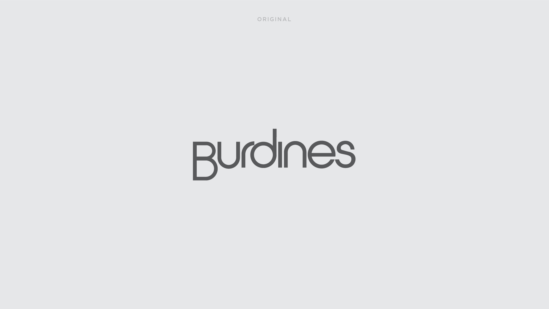
Burdines
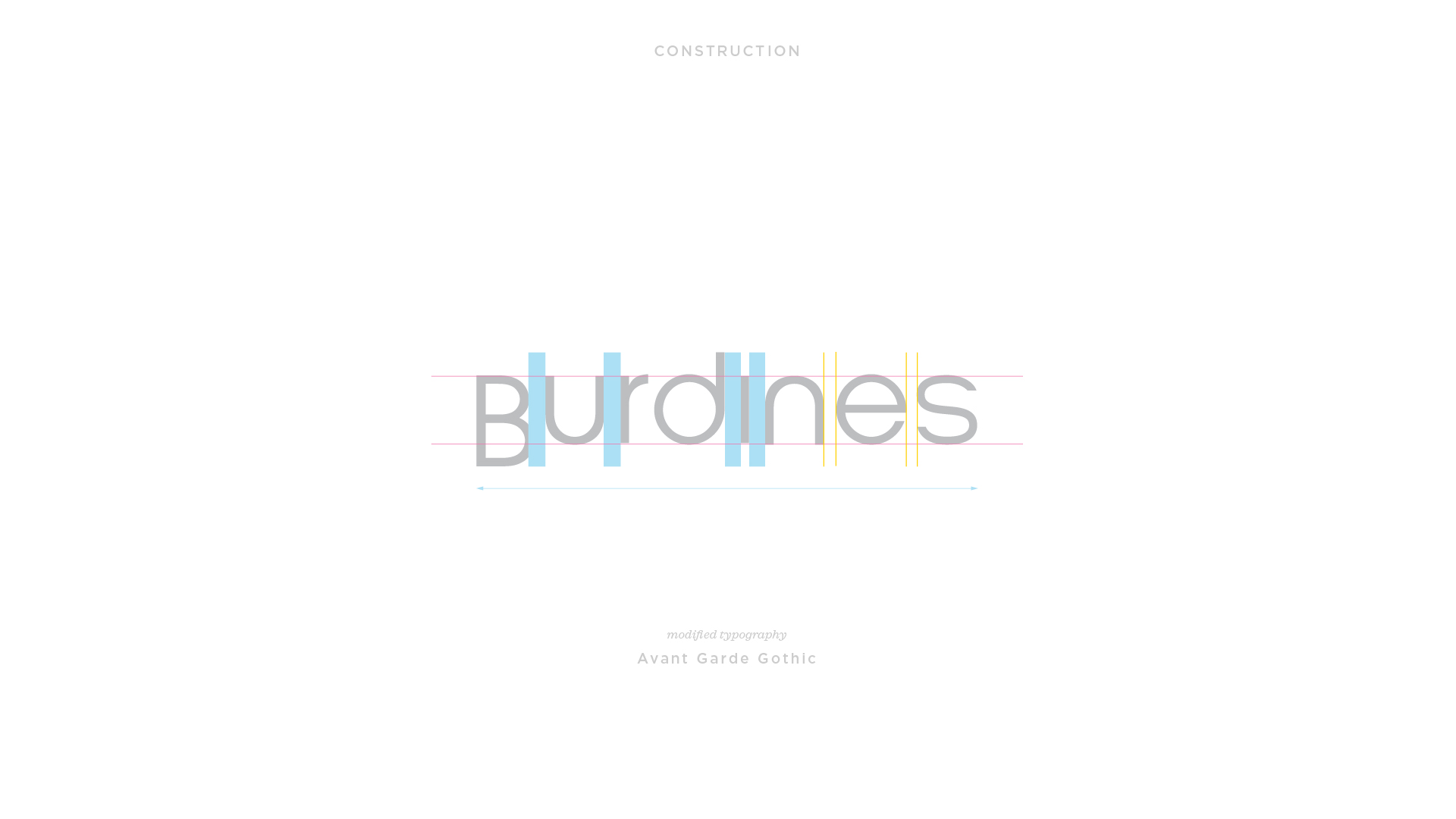
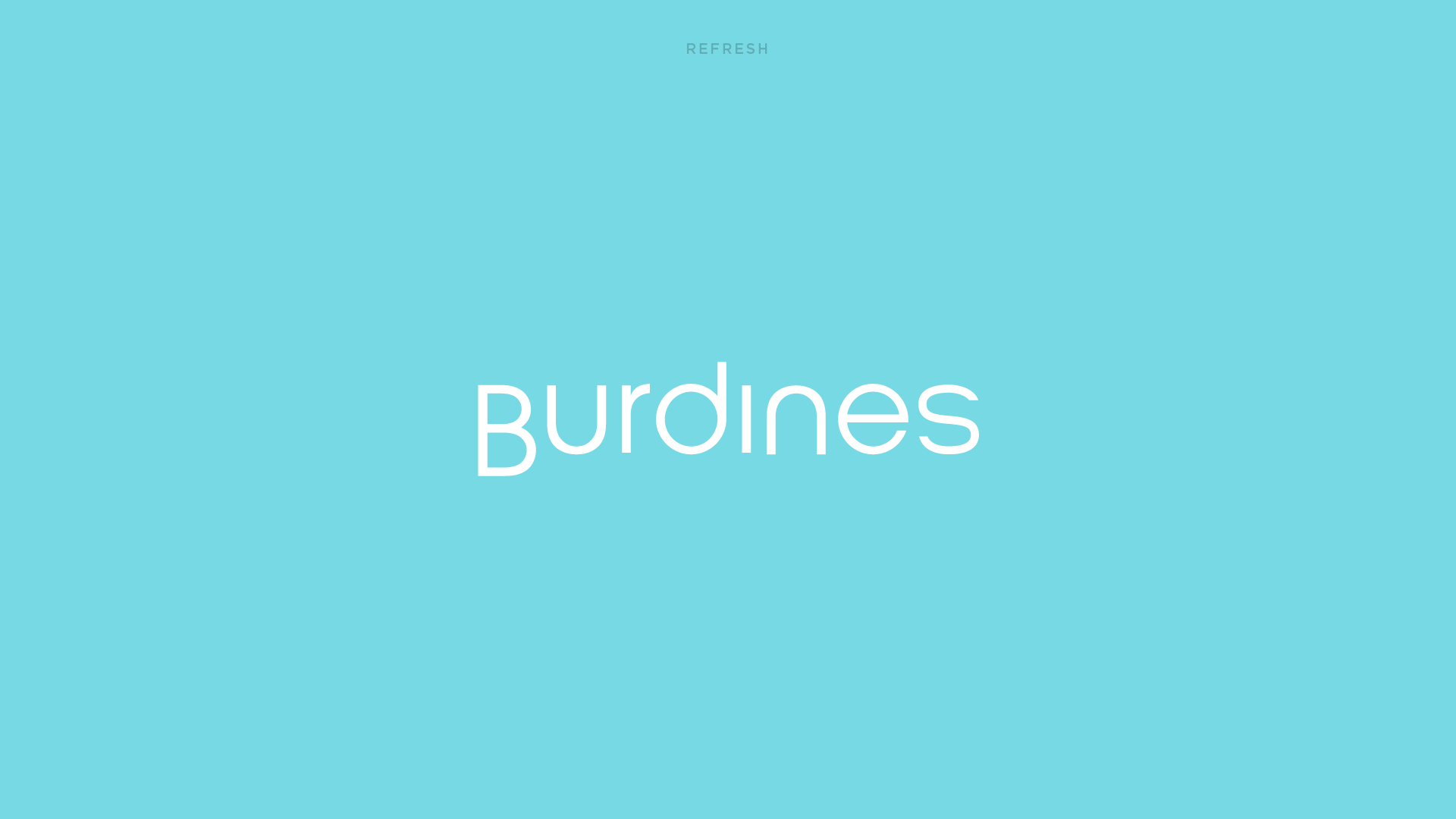
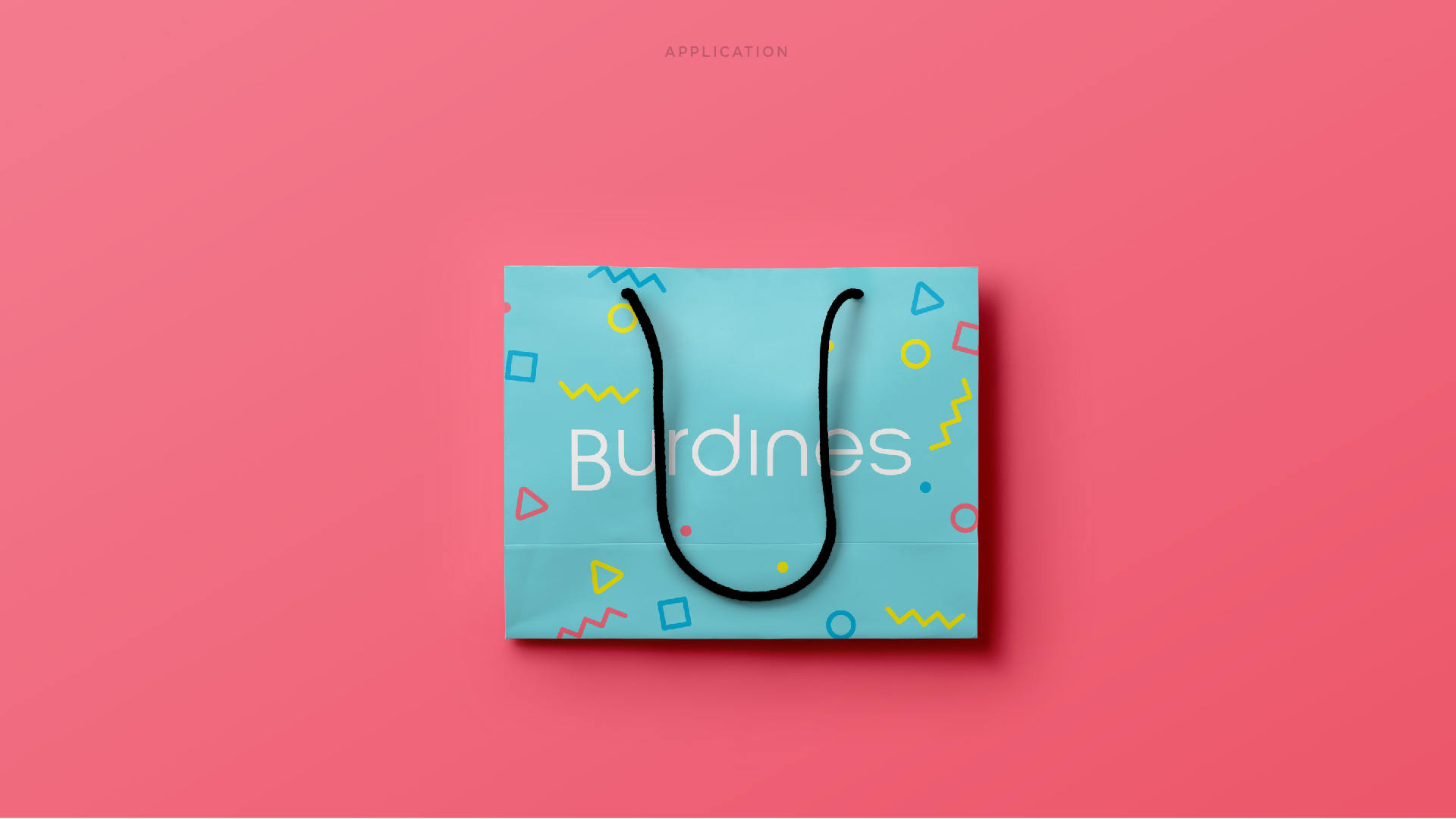
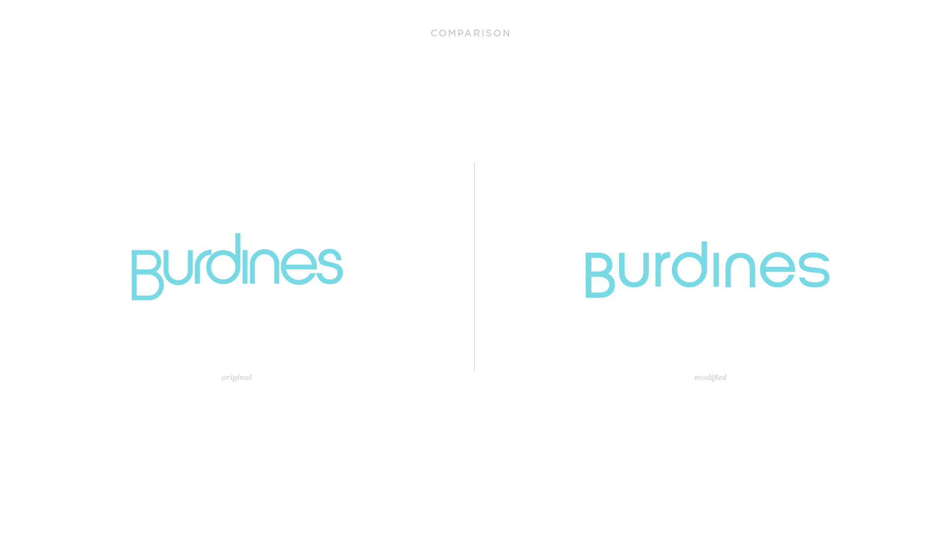
Burdines “The Florida Store” had it’s HQ right down the street in Downtown Miami. I loved the deco’esque typography and color palette of the original, felt really Miami. So I just loosened the kerning a bit to give each letter a bit more room to breathe. I also made a few modifications to the typeface.
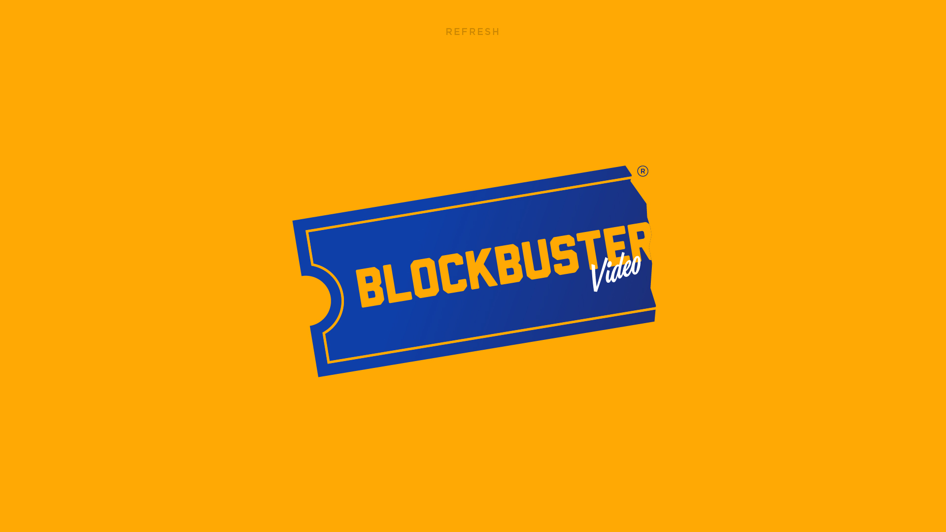
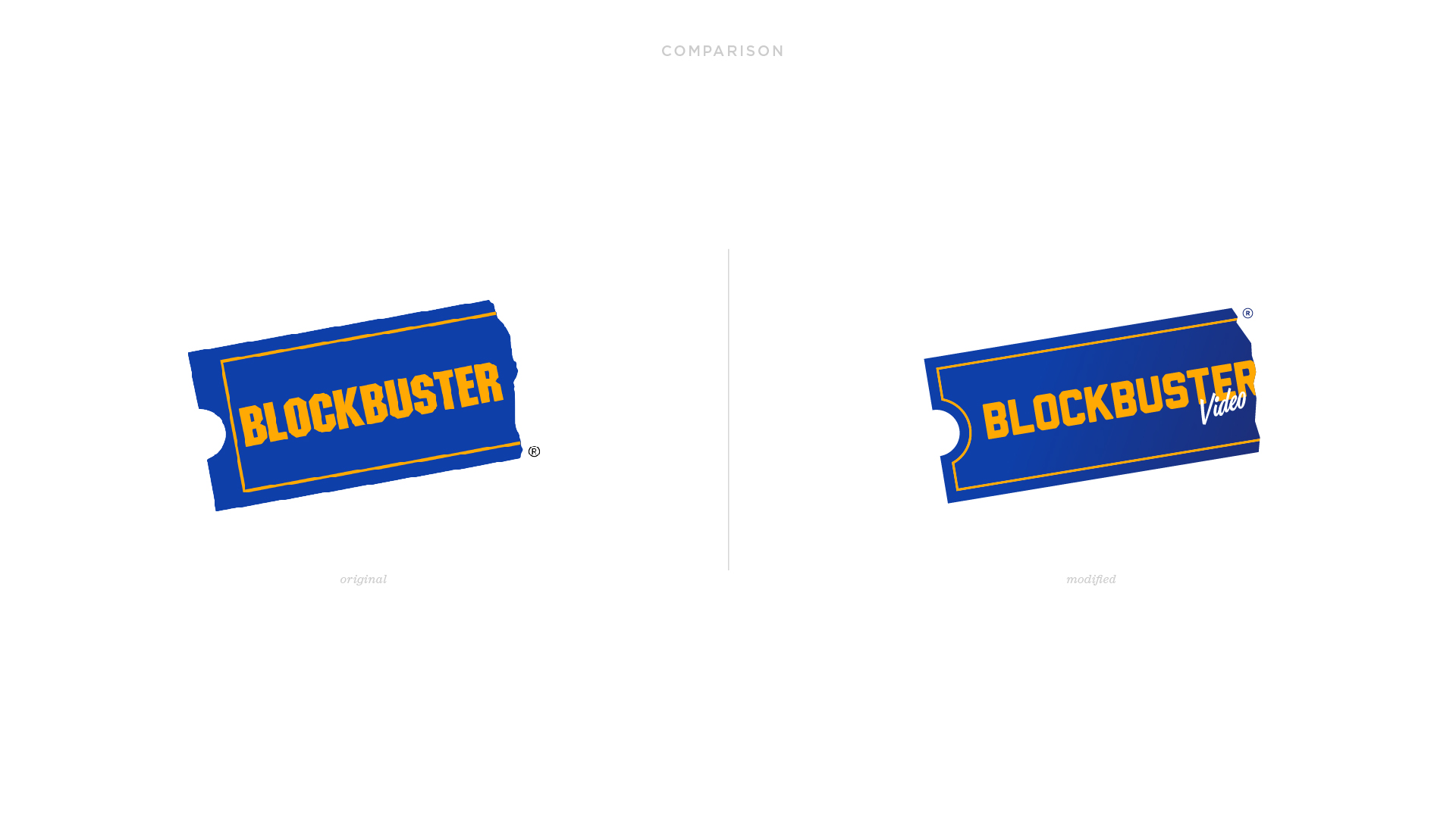
Blockbuster
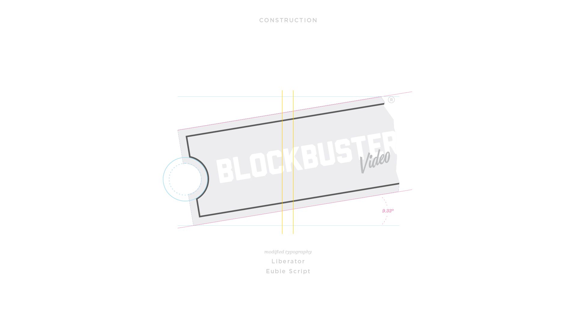
Blockbuster Video was our go-to for weekend entertainment. The logo resembled a movie ticket. The original needed a few tweaks, specially with the ticket inner-line shape. I also added the word “Video” back into the brand. I was trying to find a way to add the tagline, “what a difference!” but opted not to.
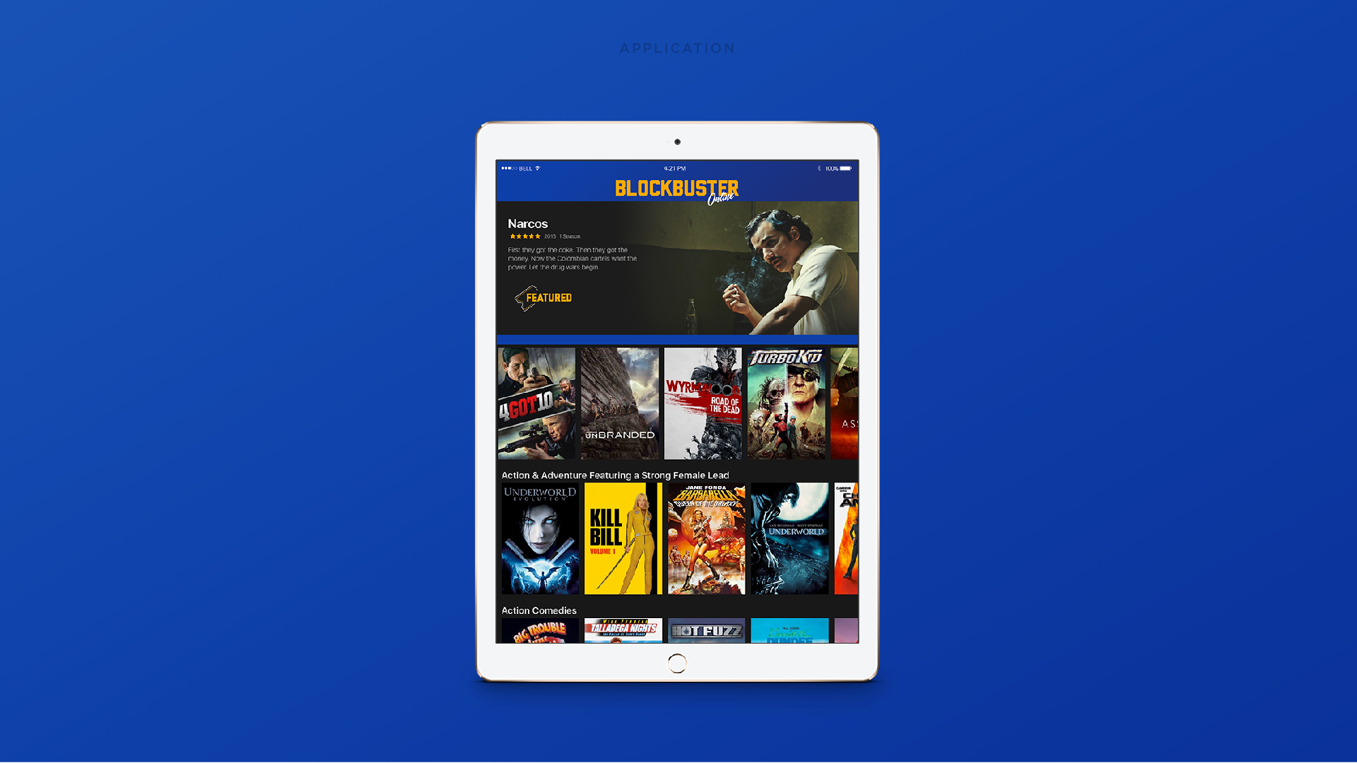
In application, here’s how Blockbuster could have evolved into a modern-day Netflix. So sad we lost a piece of our childhood.
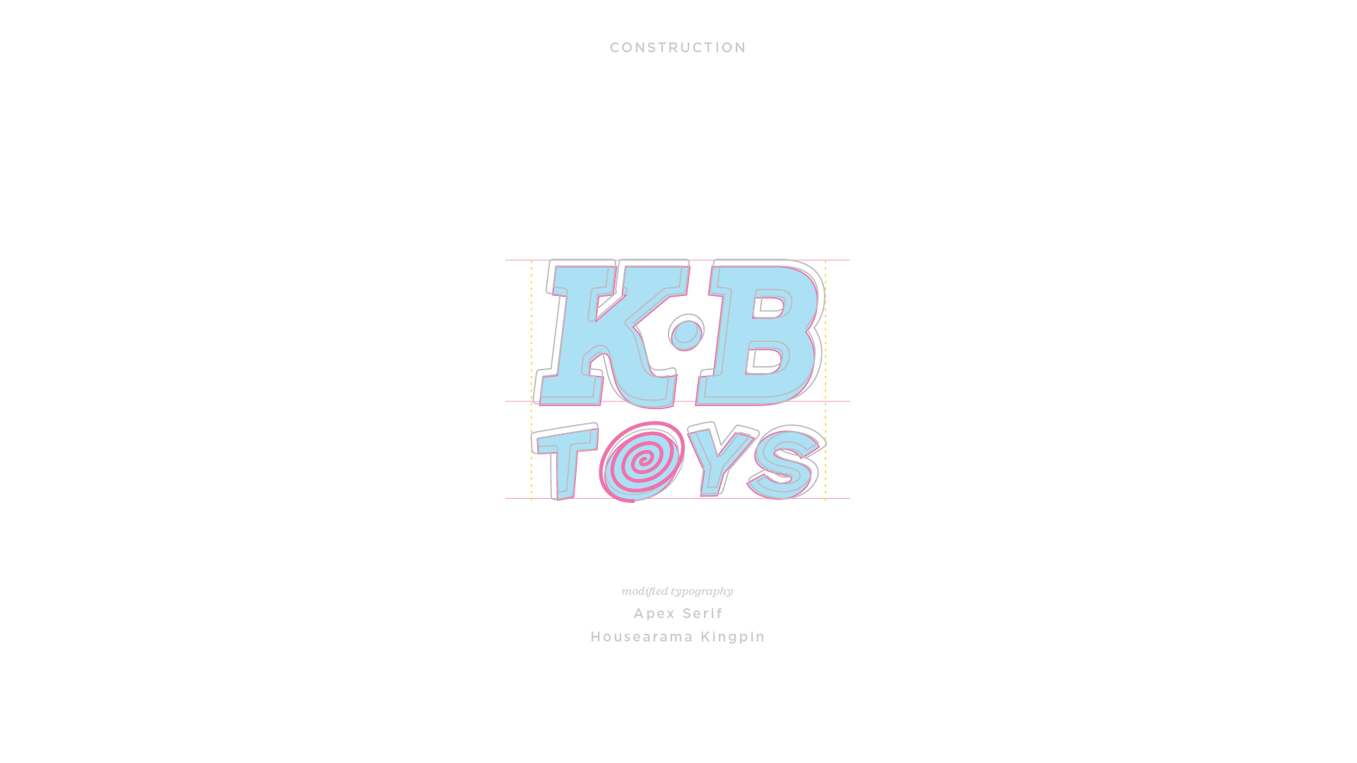
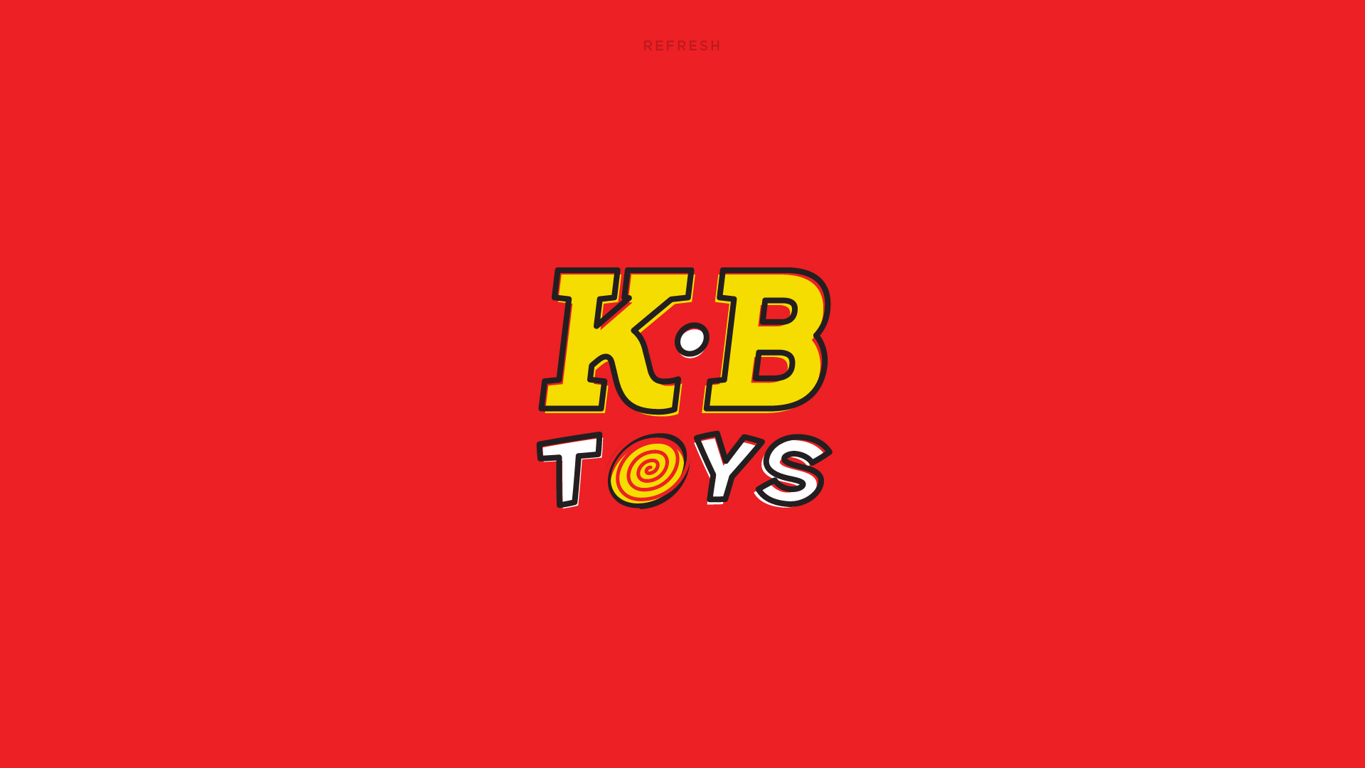
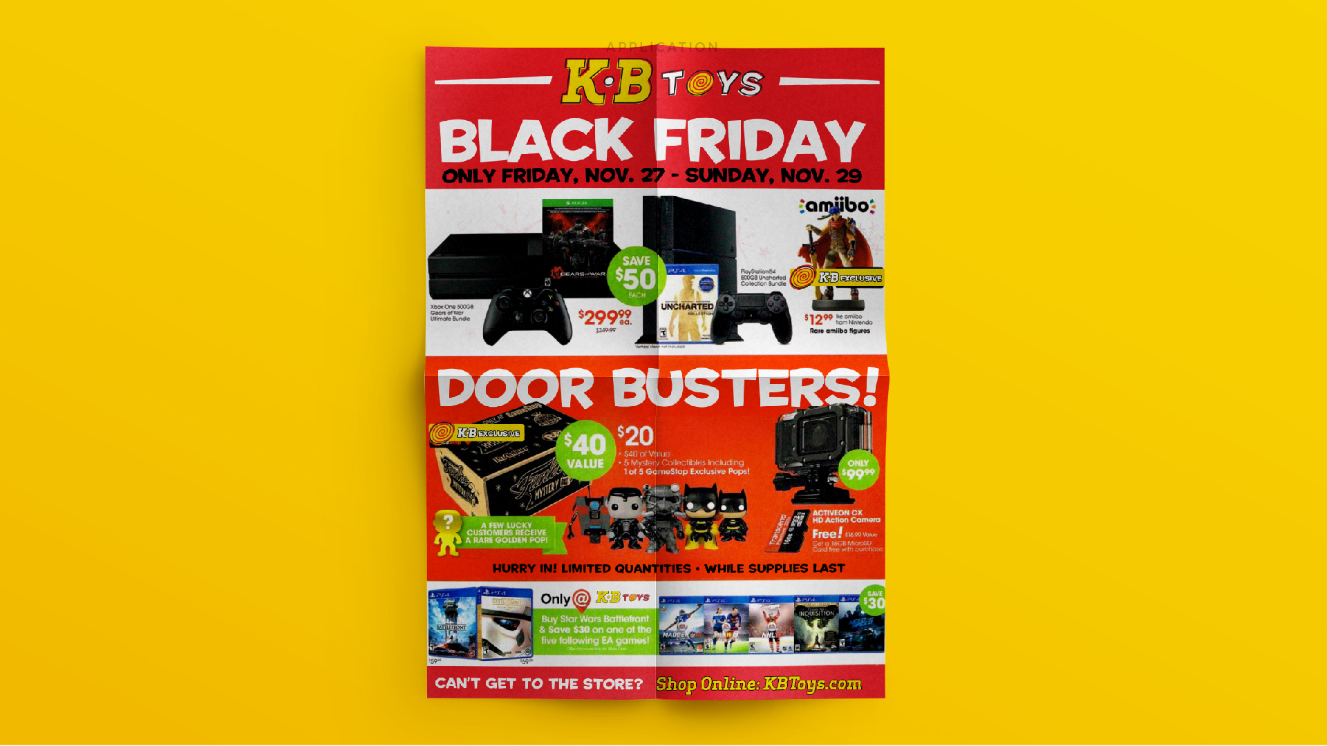
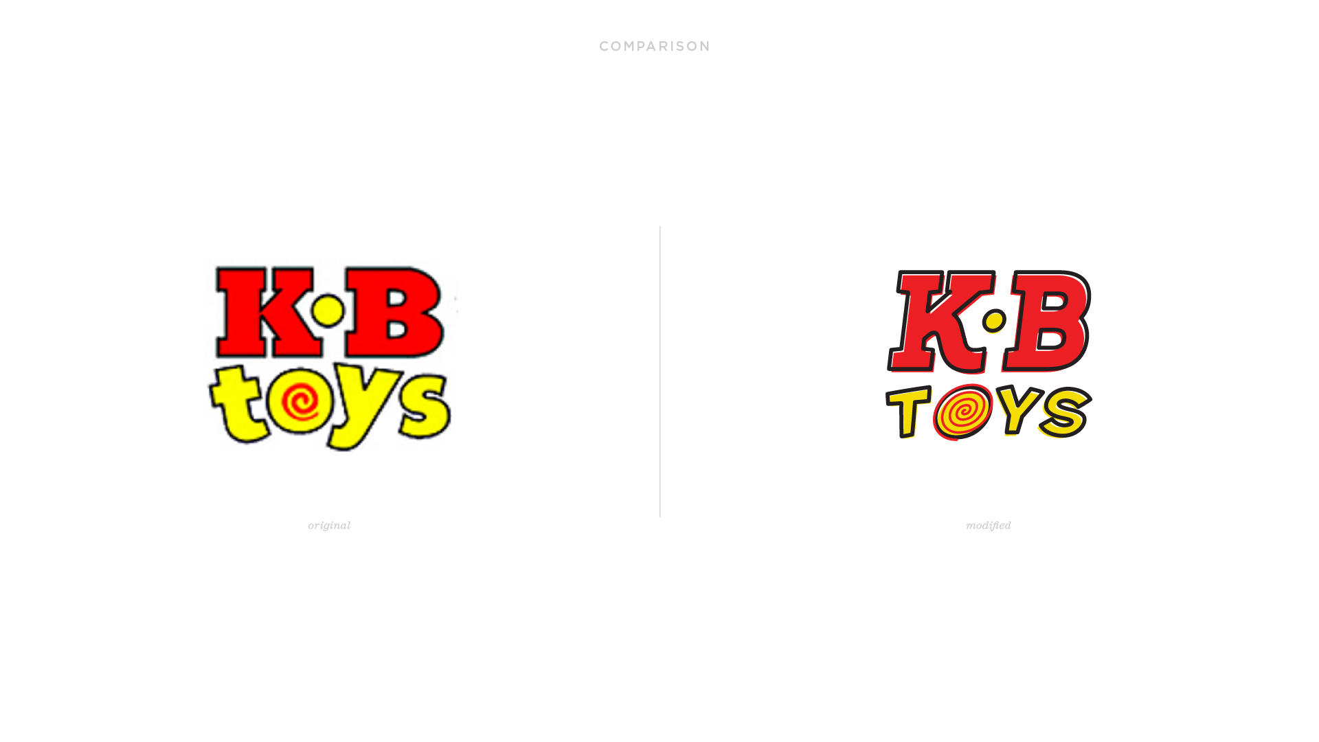
KB Toys
Good ol’ KB Toys. So many weekends spent drooling at all the amazing toys in this place at the mall.
The original logo was fun and had a lot of character. I made just a few type choice alterations while trying to maintain the youthful attributes the original had.
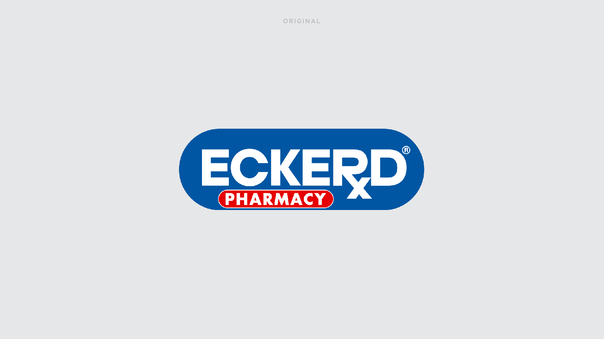
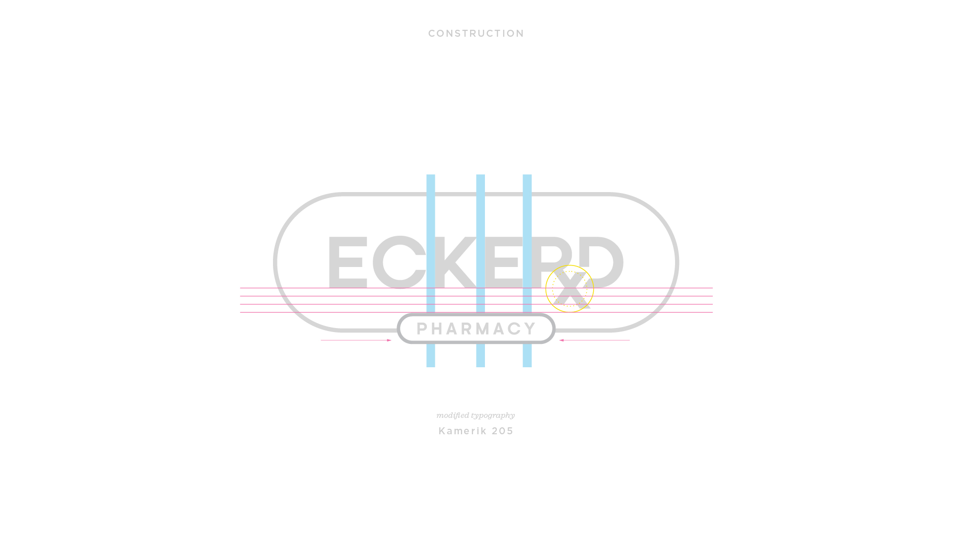
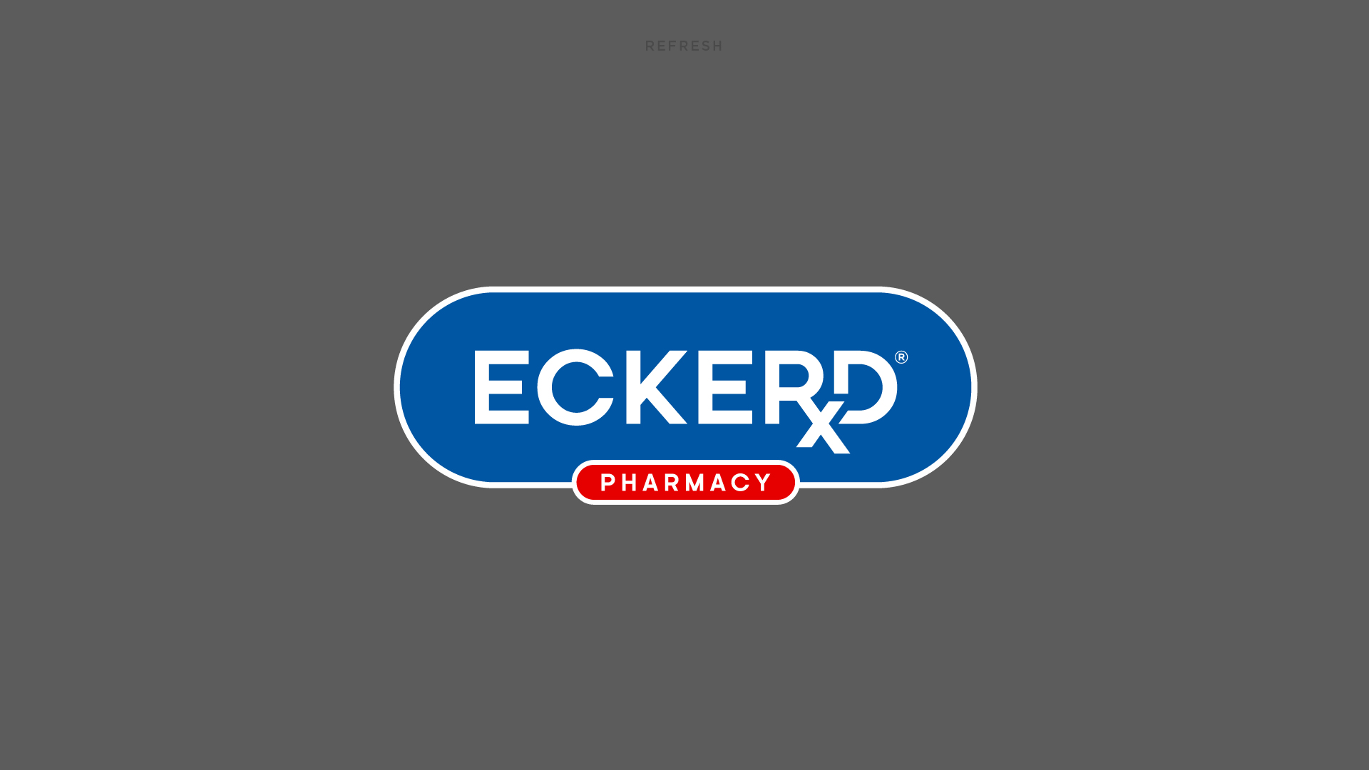
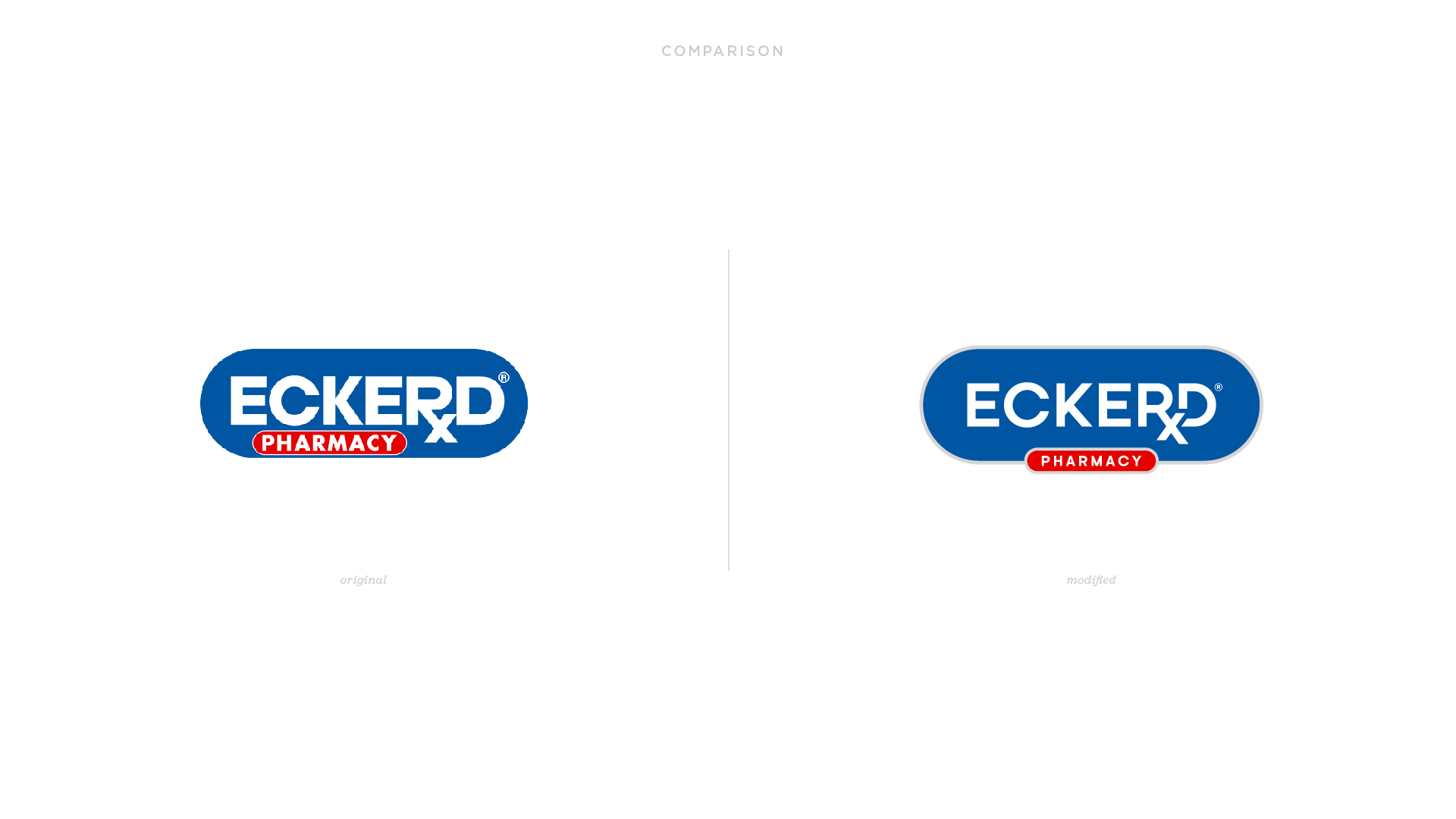
Eckerd
ECKERD’s wordmark needed a lot of work. I first had to find the typeface and fix the kerning, the characters where on top of each other. The hardest part was where the Rx meet the letter ‘D.’ You can see in the original, they tried to make it work by, awkwardly, manipulating the letter ‘R’ in order to allow the ‘x’ to fit. This was a challenge. The best way to make it work using the adjusted kerning, was to cut out negative space around the letter ‘D.’ Seemed to work pretty well.
The overall shape now of the blue and the red where ‘PHARMACY’ is resembles more of a pill.
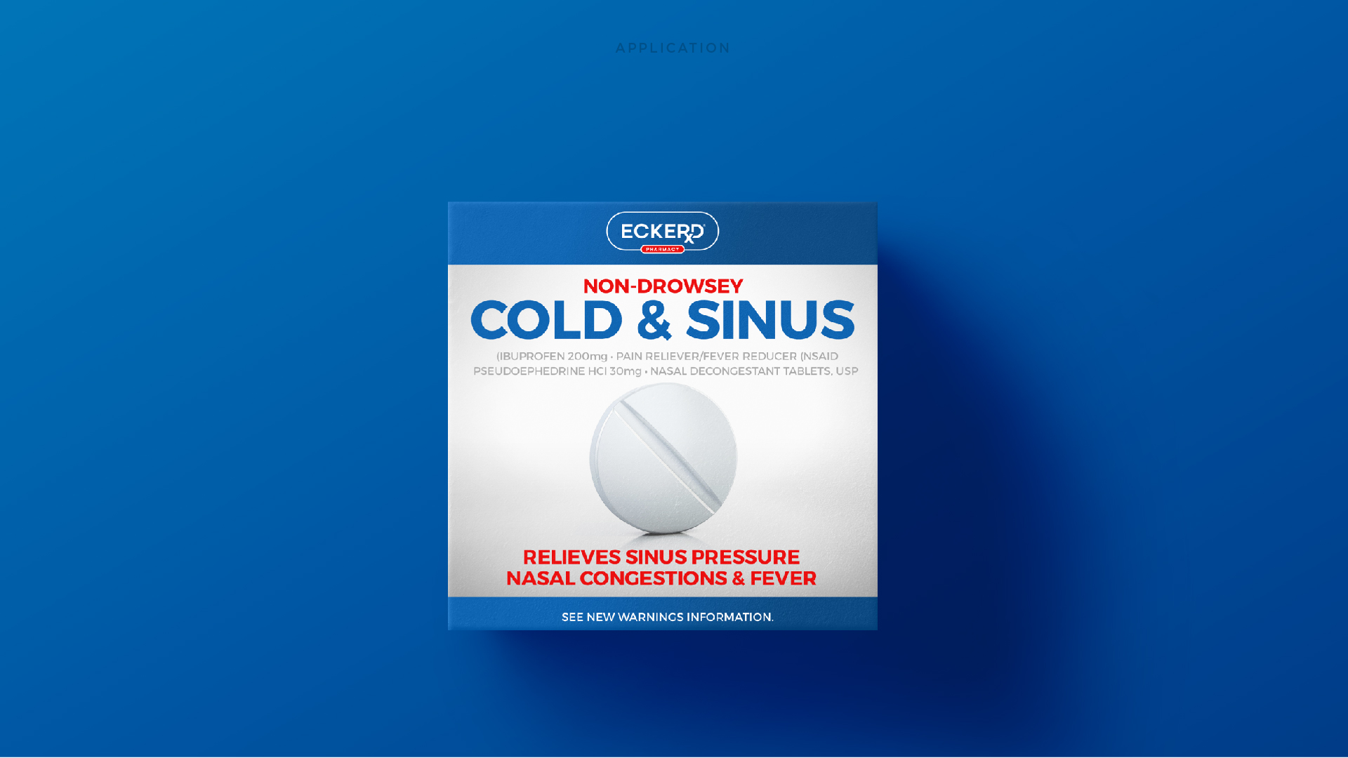
I also made a mockup of a generic ECKERD pain killer box, similar to how now CVS has their own.
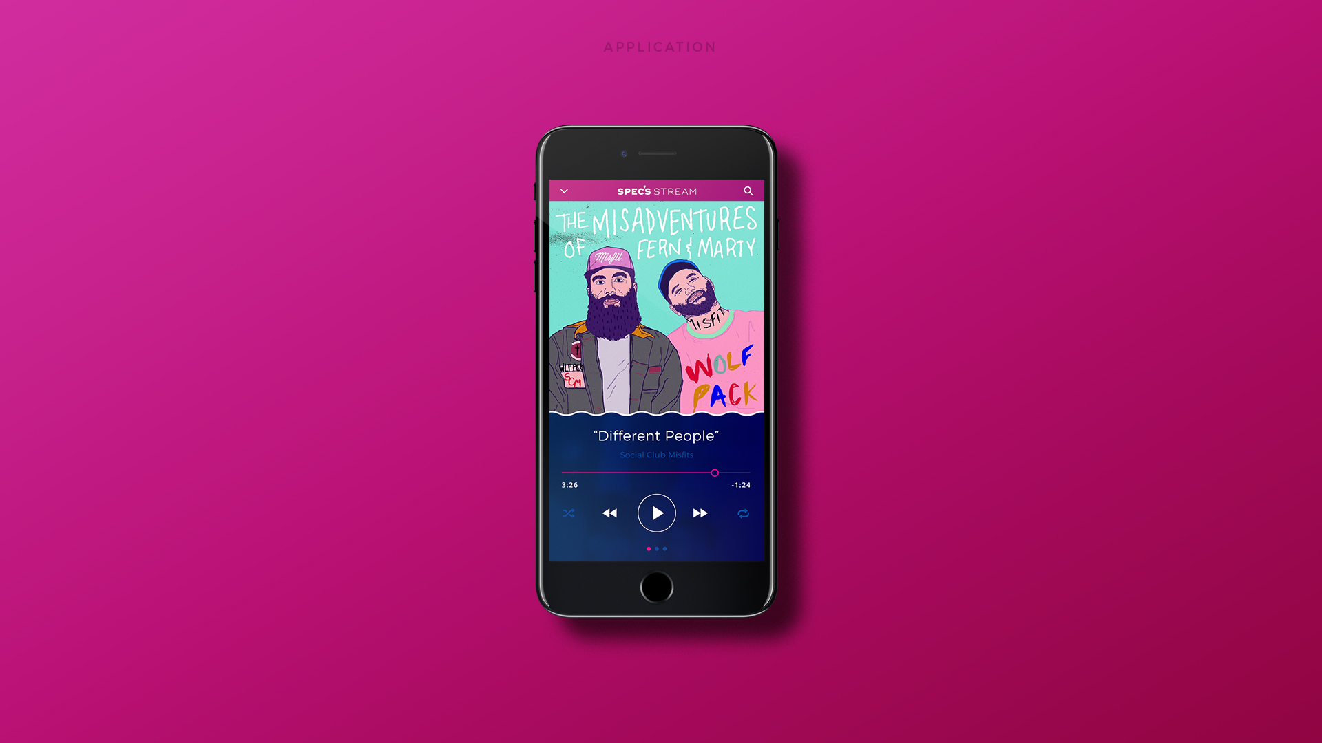
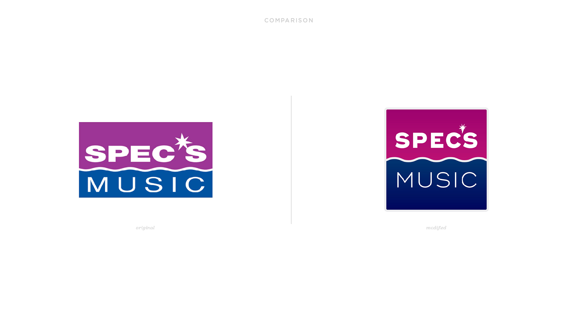
Spec's Music
I remember New Music Tuesdays at Spec’s and other music stores. This beloved spot always had the best records and CD’s/Tapes.
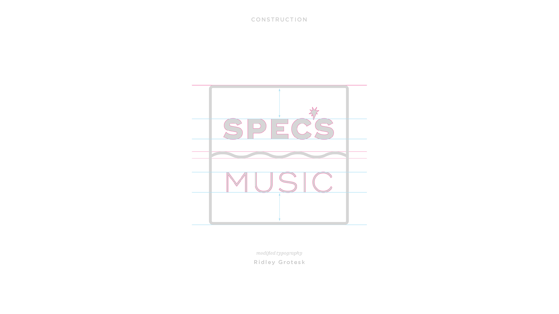
The original logo had a bit of padding issue. I gave room for the type to breathe. Also updated the”spark” or “spec” between the letter ‘C’ and ‘S’ so that it resembles more of an apostrophe.
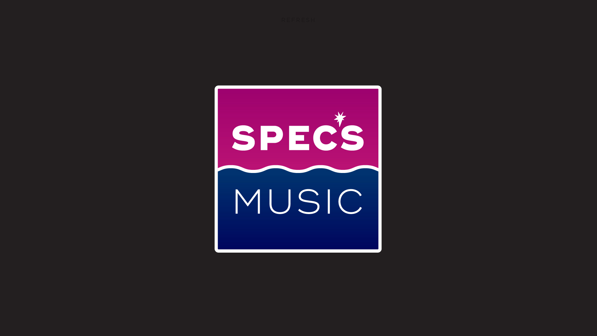
If Spec’s was still around, it would be fun to imagine them venturing into music application similar to Spotify.
Love it! great work.
I have a similar project – Re-brand for companies that no longer exist
https://www.instagram.com/logorama2000/