
Recently, I searched for Paul Rand’s work to get a zap of design inspiration. The search results were surprisingly mixed; (iconic graphic designer) Paul Rand & (presidential candidate) Rand Paul links. It was kind of neat. I wondered “Hmm, what if Paul Rand was hired by Rand Paul, that would be something.” After all, seems like political candidates (besides President Obamas branding campaign team) treat their identities as an after-thought. Remember Moving Brands rebrand of Mrs. Clinton’s campaign? It was glorious.
With much respect to the legendary designers craft, I gave the Paul Rand test a try; a Rand Paul branding identity inspired by Paul Rands identity work. A swiss style approach at letter form, using Rand Pauls initials. A simple, strong logotype. The rest of the campaign I took liberties to go whichever direction I thought best.
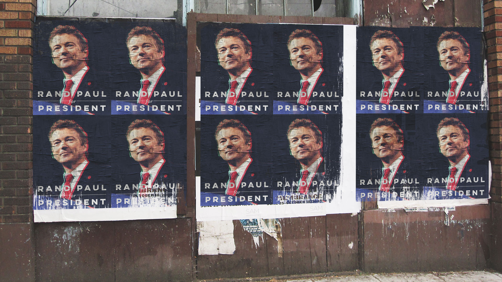
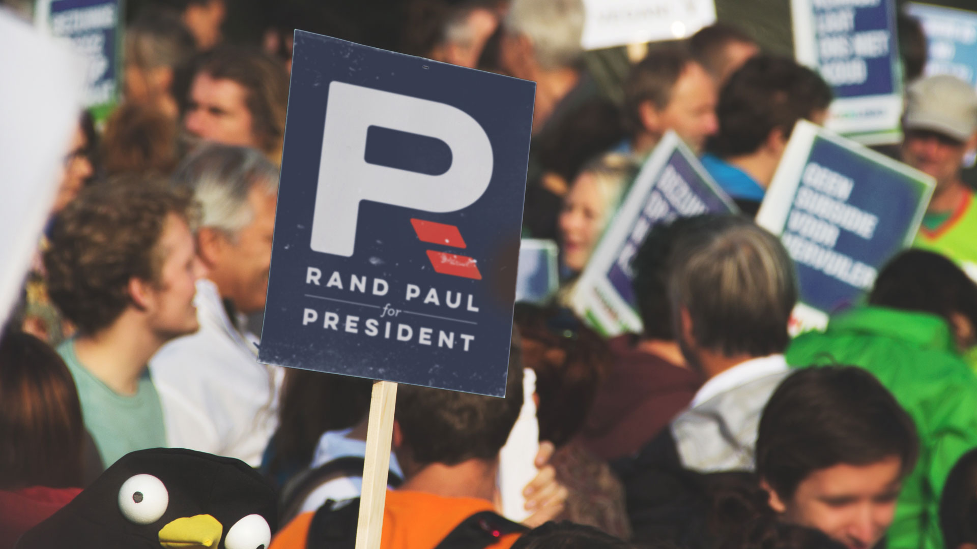
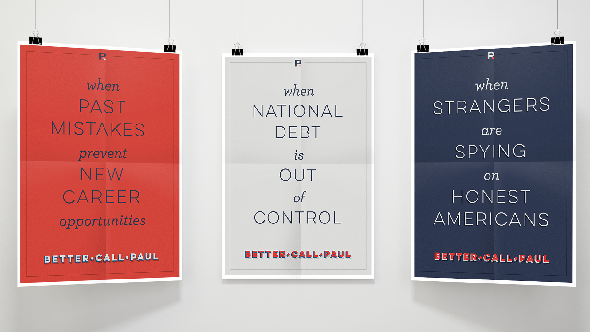
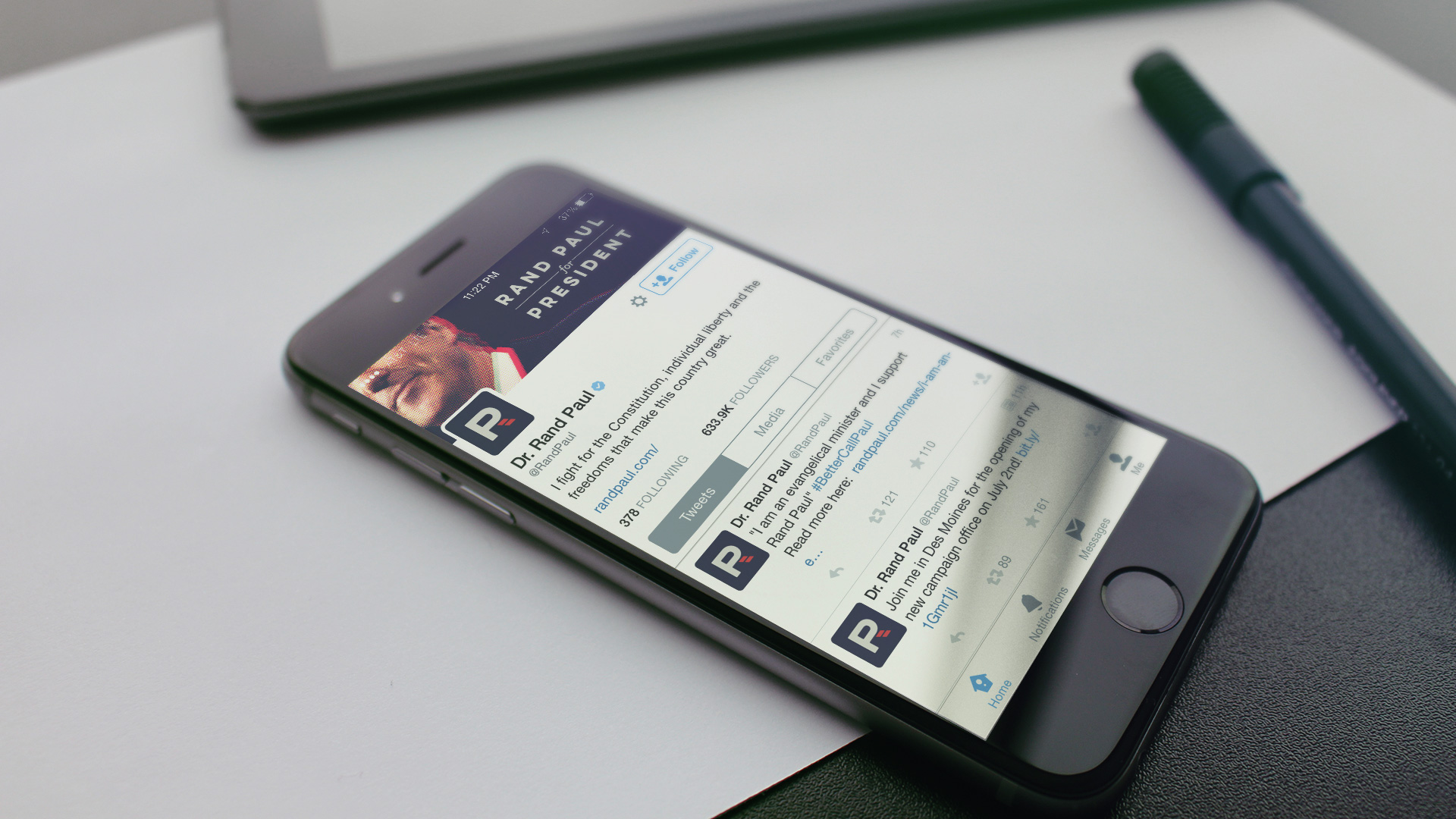
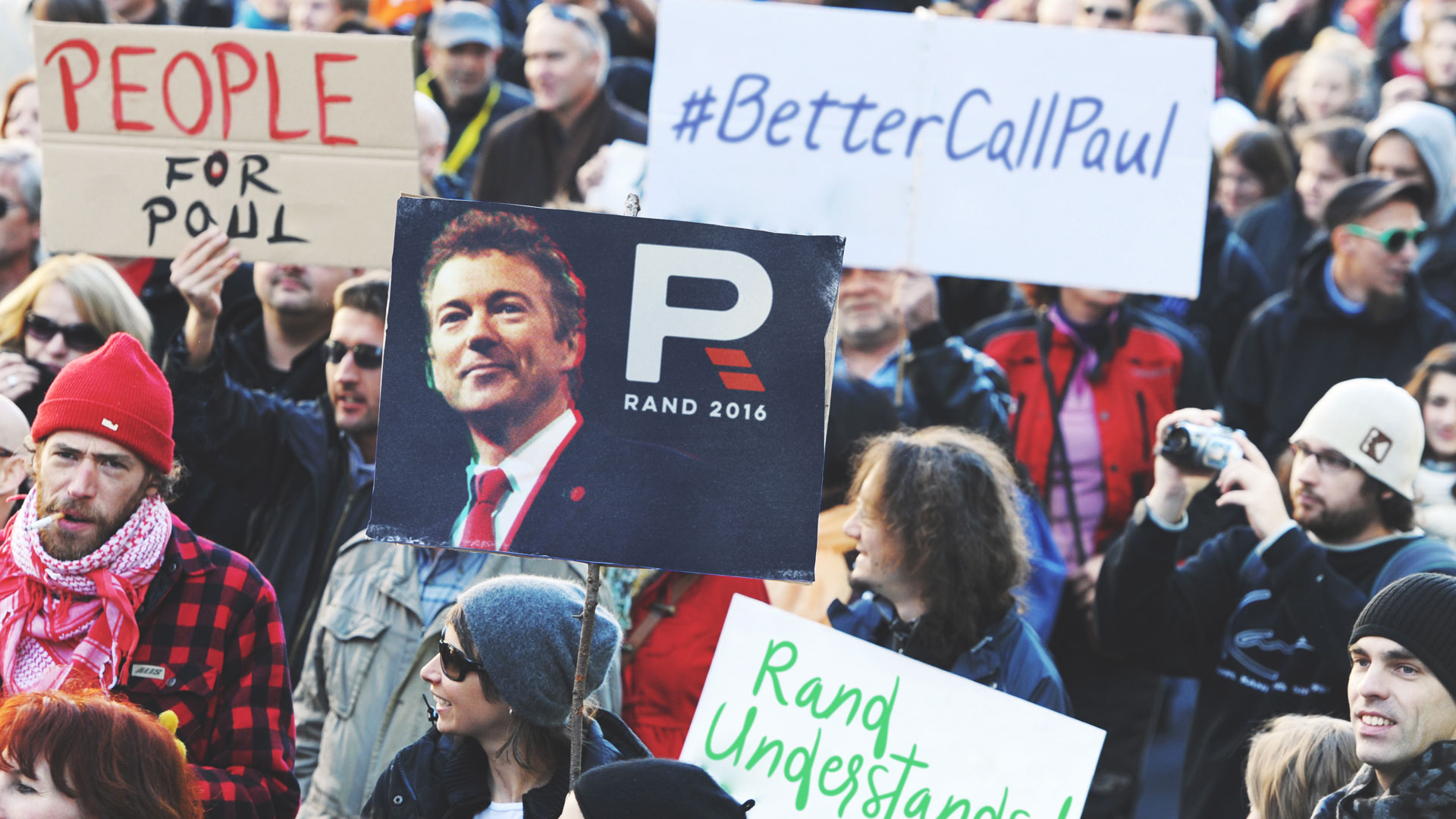
In order to see the brand in application, I create some mini-campaigns for Rand Paul. One including some typographical posters with the issues the candidate stands for and another, bold and quirky tagline #BetterCallPaul (along with “Rand Understands!”) a clever take on a pretty popular TV show to keep things fresh and relevant.
The whole hypothetical rebrand, research and campaign was done under 36 working hours. Clearly not enough time invested, but as a quickee project it turned out pretty neat in my opinion. It goes without saying, in no way do I believe this is how Paul Rand would approach a rebrand, more of a brand inspired by his work.
Take a look and leave some feedback! Enjoy.
Rand Paul Rebrand
Branding
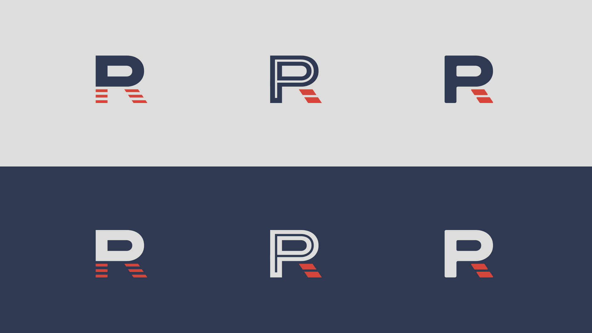
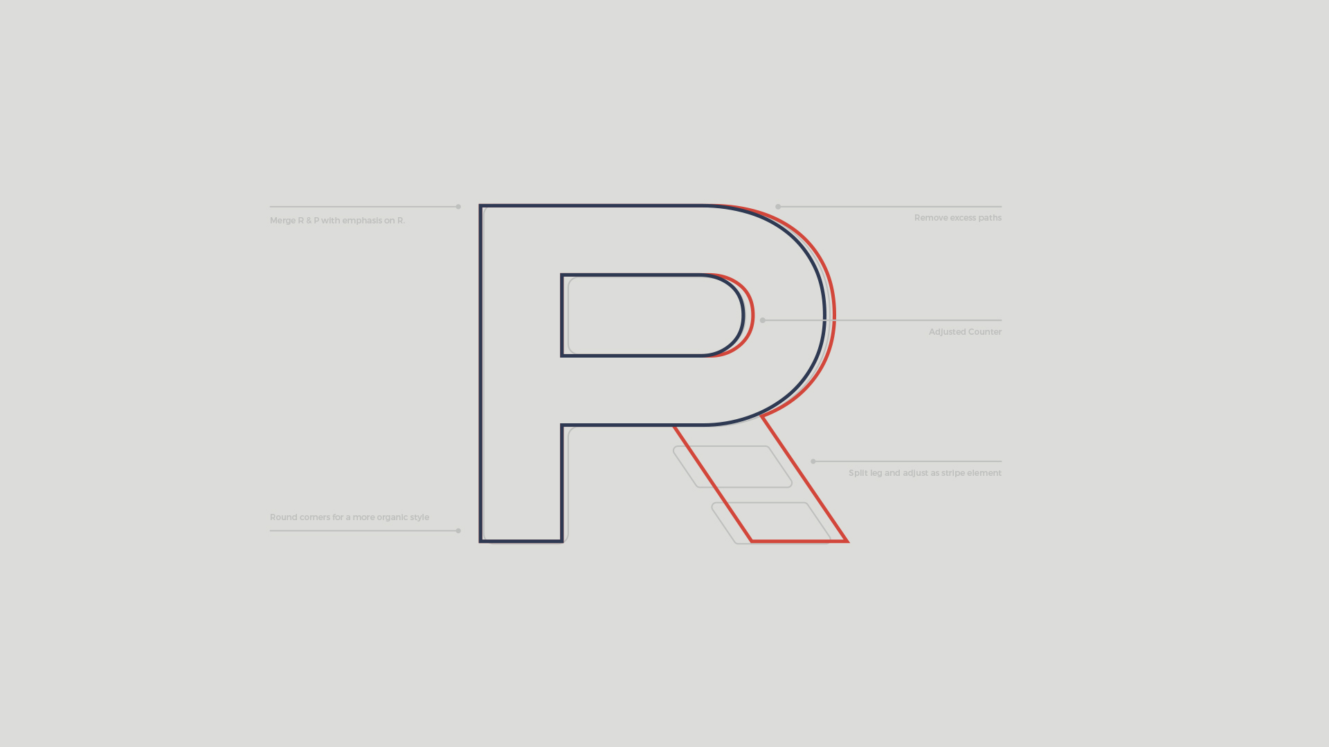
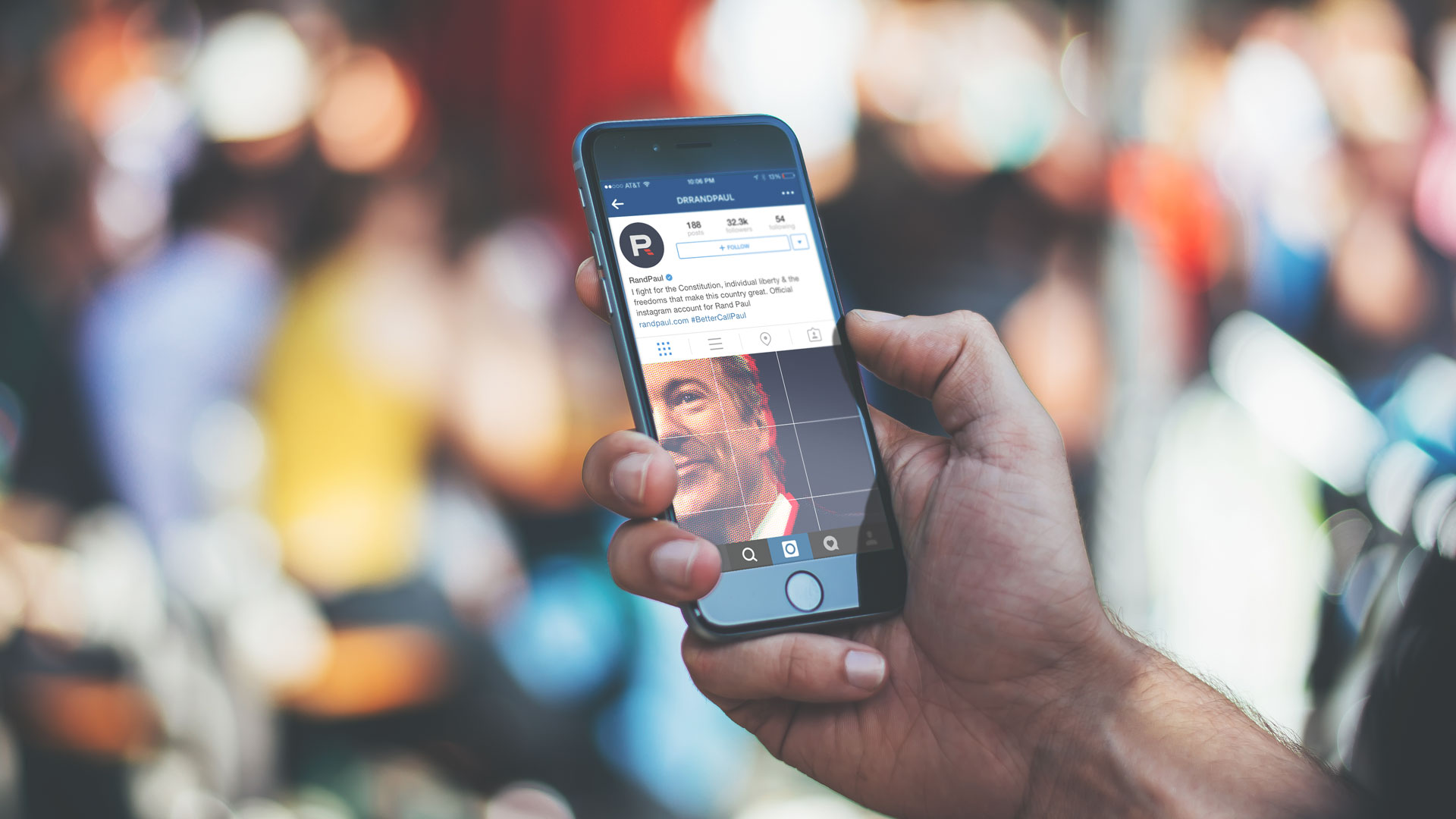
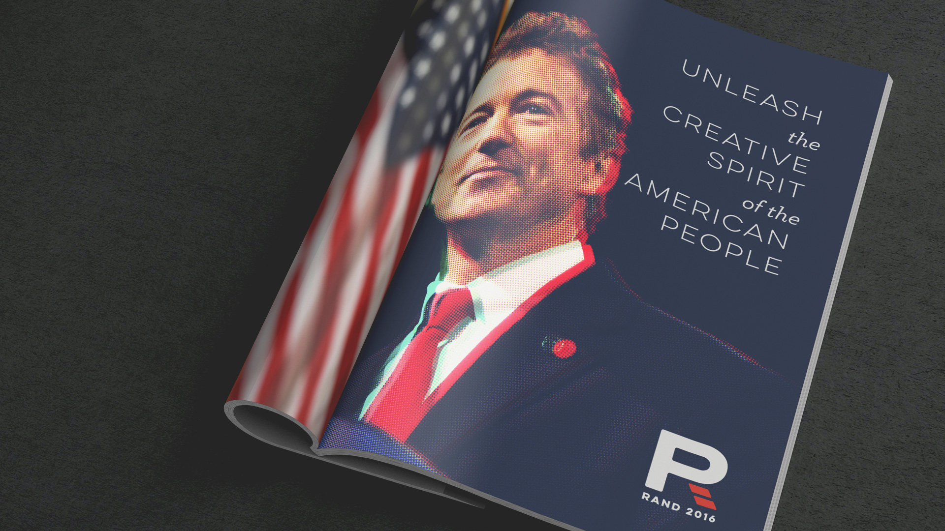
I wanted to stay away from stars, flags, but decided to keep the stripes for the logotype. Merging an R and a P, easily recognizable.
Color Palette
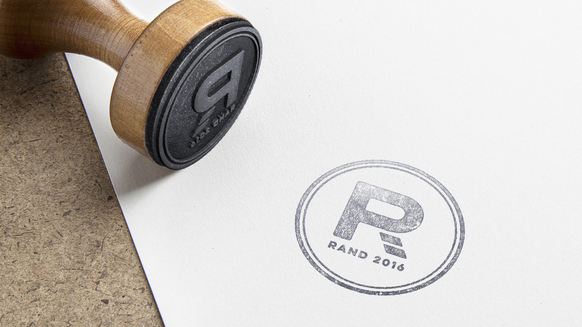
The muted red, white and blue, gives a sense of age and experience. I thought it really works in different media channels.
Image Treatment
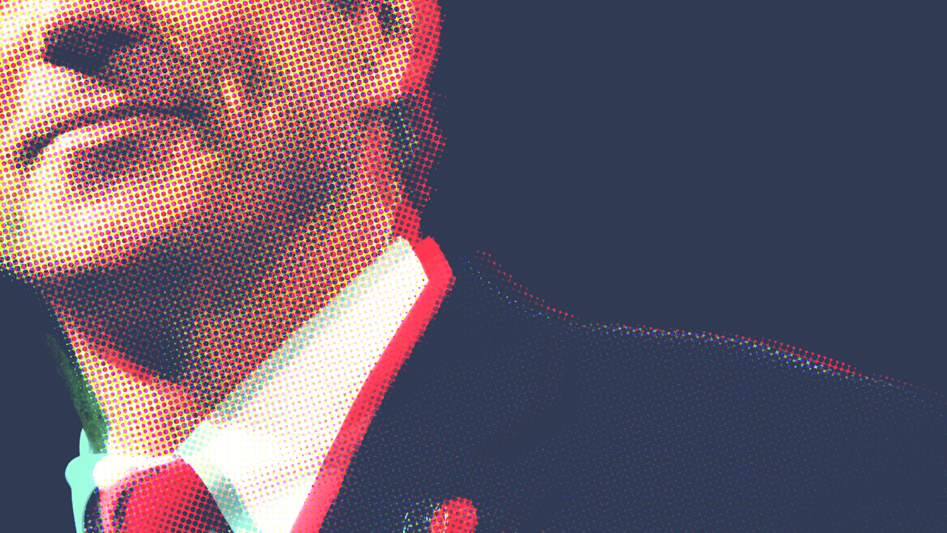
The goal was to use iconic imagery that can fit in patrons hands at a rally the same as right on a brick wall in an alley way. The half-tone effect, colors and effects gives it a bit of a dated, mis-print, type of look.
Tagline(s)
I used a few of his talking points to drive home what the candidate stands for and wrap it with the neat #BetterCallPaul tagline. The goal was to use the talking points to relate to various generations of people and the quirky tagline to expand the demographic to the younger generation. They’ll get it.